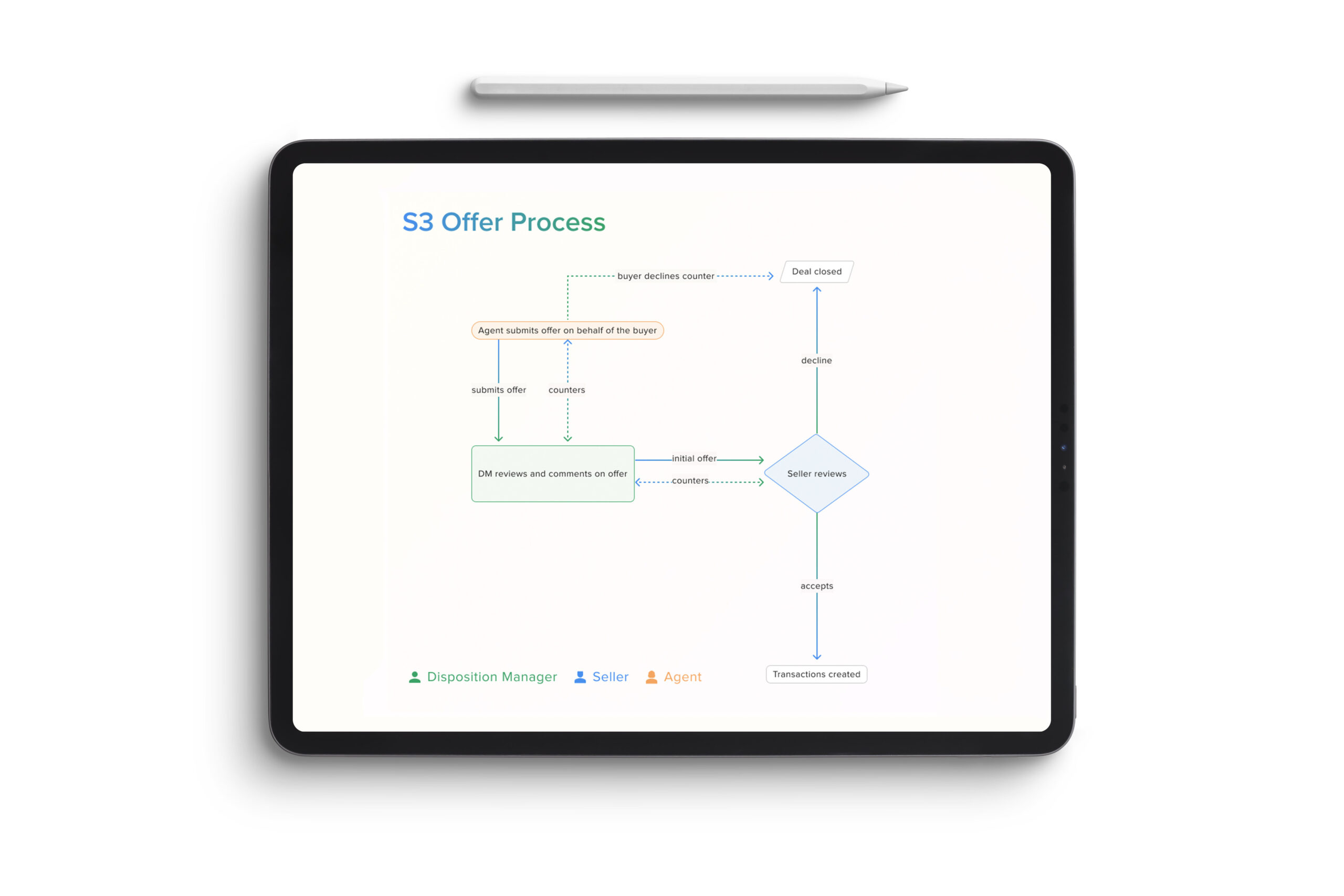
The S3 Offer Process streamlines how offers are created, reviewed, and approved across multiple stakeholders. Agents can submit offers on behalf of buyers directly within the platform, eliminating fragmented communication and manual file exchanges. Disposition Managers can review, comment, and provide real-time feedback before the offer is sent to the seller.
S3 Offer Workflow
A unified workflow for faster, clearer offer decisions
Once submitted, sellers can accept, decline, or counter directly in the system—triggering instant visibility and transaction creation upon acceptance. This unified workflow reduces operational friction, shortens negotiation cycles, and keeps every decision point transparent and traceable across teams.
The Results
“S3 transformed how our team manages offers. What used to take days now happens in minutes — and we finally have visibility across every transaction.”
Empowering faster, data-driven decisions across every offer.
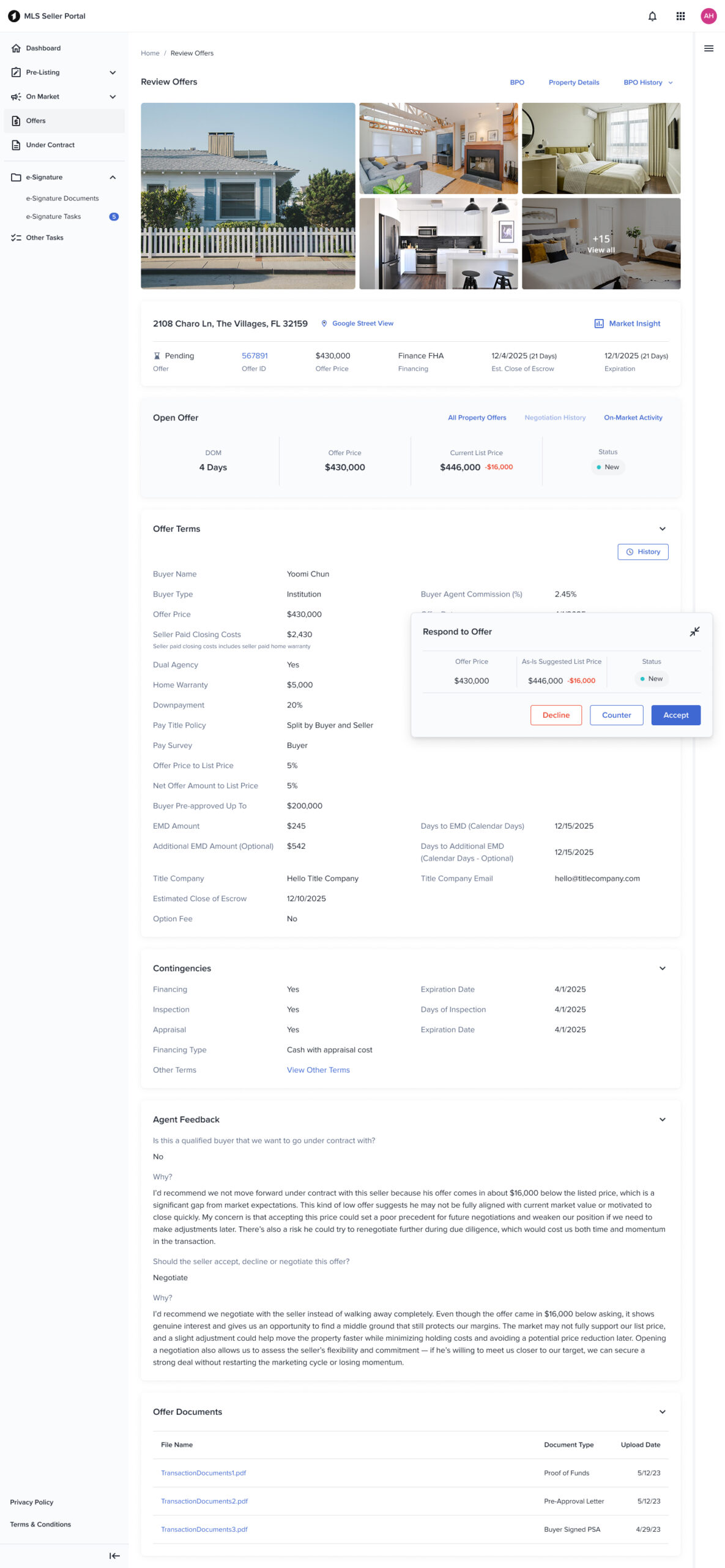
The Offer Review workflow was designed to help Disposition Managers and Agents move through complex, data-dense decisions with clarity and speed. Every interaction—from the universal navigation to the action card—was built to surface the most critical insights without losing the holistic view of the deal. By keeping all key data visible and minimizing page switching, users could underwrite properties, compare offers, and take action within a single, streamlined view. Our collapsible navigation, open data cards, and dynamic CTA system reduced cognitive friction and supported how users naturally think: like underwriters, not app users.
Still, building for such a data-heavy environment came with challenges. Balancing density with readability, ensuring CTAs stayed visible without obstructing information, and designing scalable card patterns that could adapt to new states required multiple rounds of testing and iteration. While the workflow proved successful—significantly improving offer turnaround and user confidence—it also highlighted the ongoing tension between flexibility and simplicity in enterprise UX. Every iteration continues to bring us closer to the ideal balance: a product that feels light, even when the data isn’t.
42
Reduction in manual effort across offer processing
32
Increase in offers managed end-to-end within S3
120000
Estimated annual savings in admin time and coordination costs
Designing at scale
Balancing data density with effortless usability.
Universal navigation
Our navigation system had to work across all personas and institutional products. We ran a week-long design sprint with a small group of designers and PMs to align on discrepancies, dependencies, and usage patterns. Because S3 is extremely data-heavy and every corner of the interface carries important functionality, the navigation needed to stay accessible without overwhelming the UI. The final solution is a collapsible yet prominent navigation—allowing users to focus on content while maintaining consistent access to global actions.
Offer data
The offer section needed visual prominence without competing with underwriting data that disposition managers and sellers rely on for decision-making. I used our standard card component for consistency but introduced a subtle background tint to give the offer area its own hierarchy. This approach also makes the component scalable—allowing us to easily incorporate future states like warnings or errors through contextual color changes without redesigning the structure.
Data cards
Displaying dense information efficiently was one of S3’s biggest UX challenges. Through user interviews and preference testing with all three personas, we learned that while hiding sections made the interface look cleaner, users preferred having all data visible by default—mirroring their workflow in traditional spreadsheet-based underwriting. Based on this feedback, we left all data cards open by default but provided the option to collapse sections when needed. This design keeps power users fast while still accommodating those who want a more focused view.
Action card
Initially, I embedded the main CTA under the offer section, assuming it was the most critical interaction point. However, usability testing (A/B and 5-second tests) showed that users constantly scrolled up and down the page gathering information for pricing analysis, making a static CTA impractical. We introduced a floating “action card” that follows the user as they navigate. The first iteration had visibility issues—overlapping key data on smaller viewports—so we made it collapsible. This resolved most visibility concerns and received positive feedback. We’re continuing to iterate on this pattern to refine responsiveness and contextual behavior.