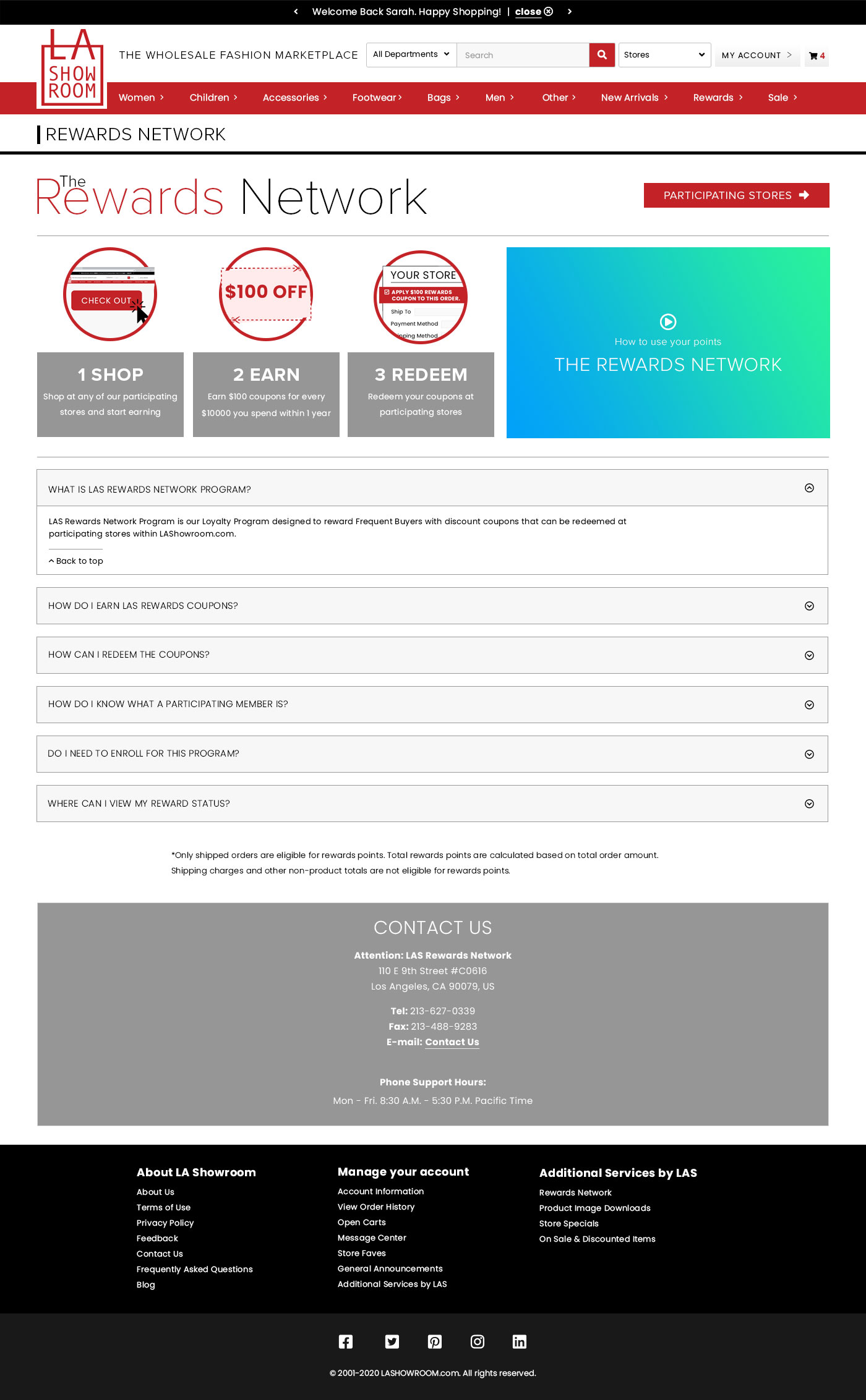
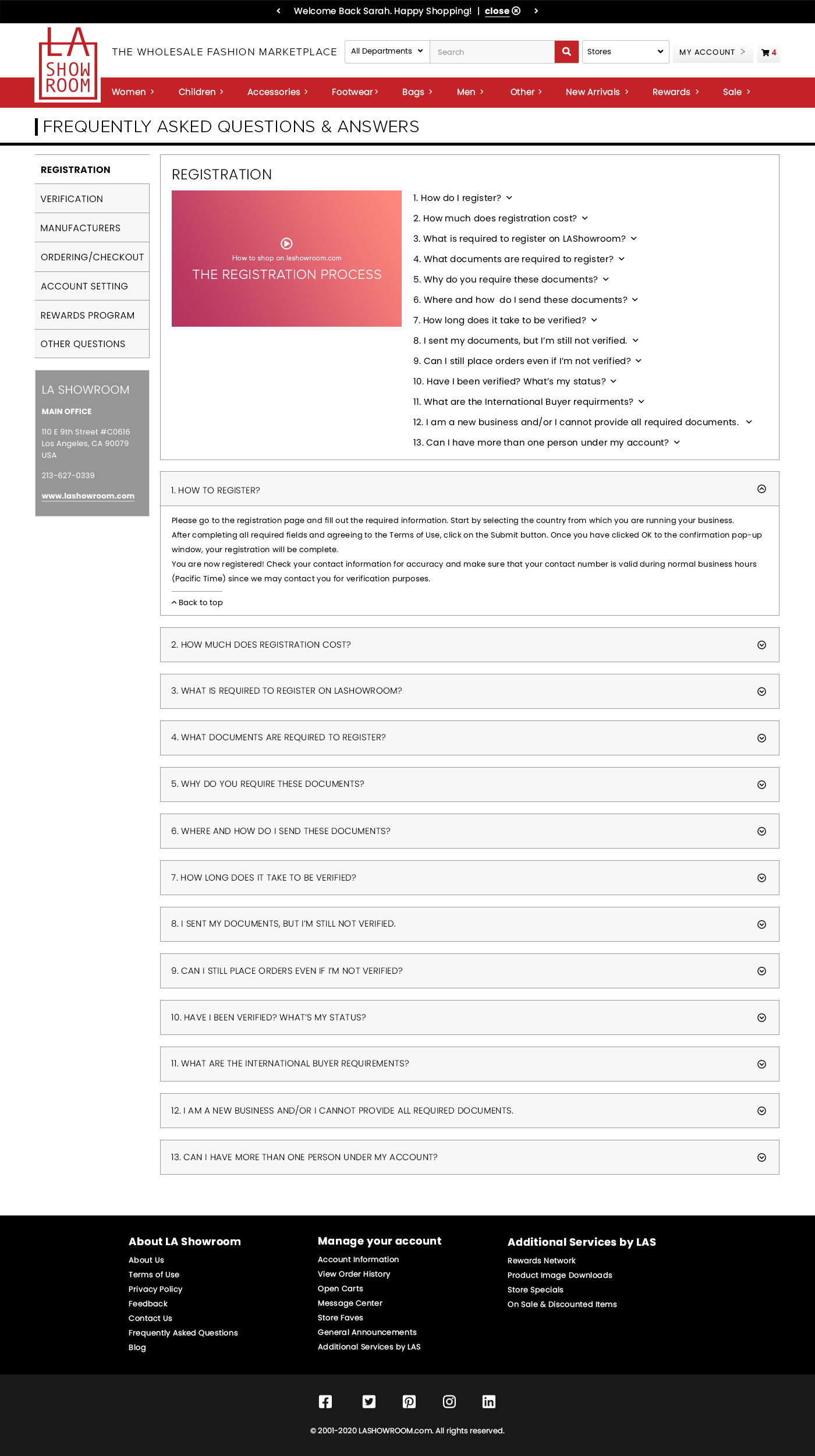
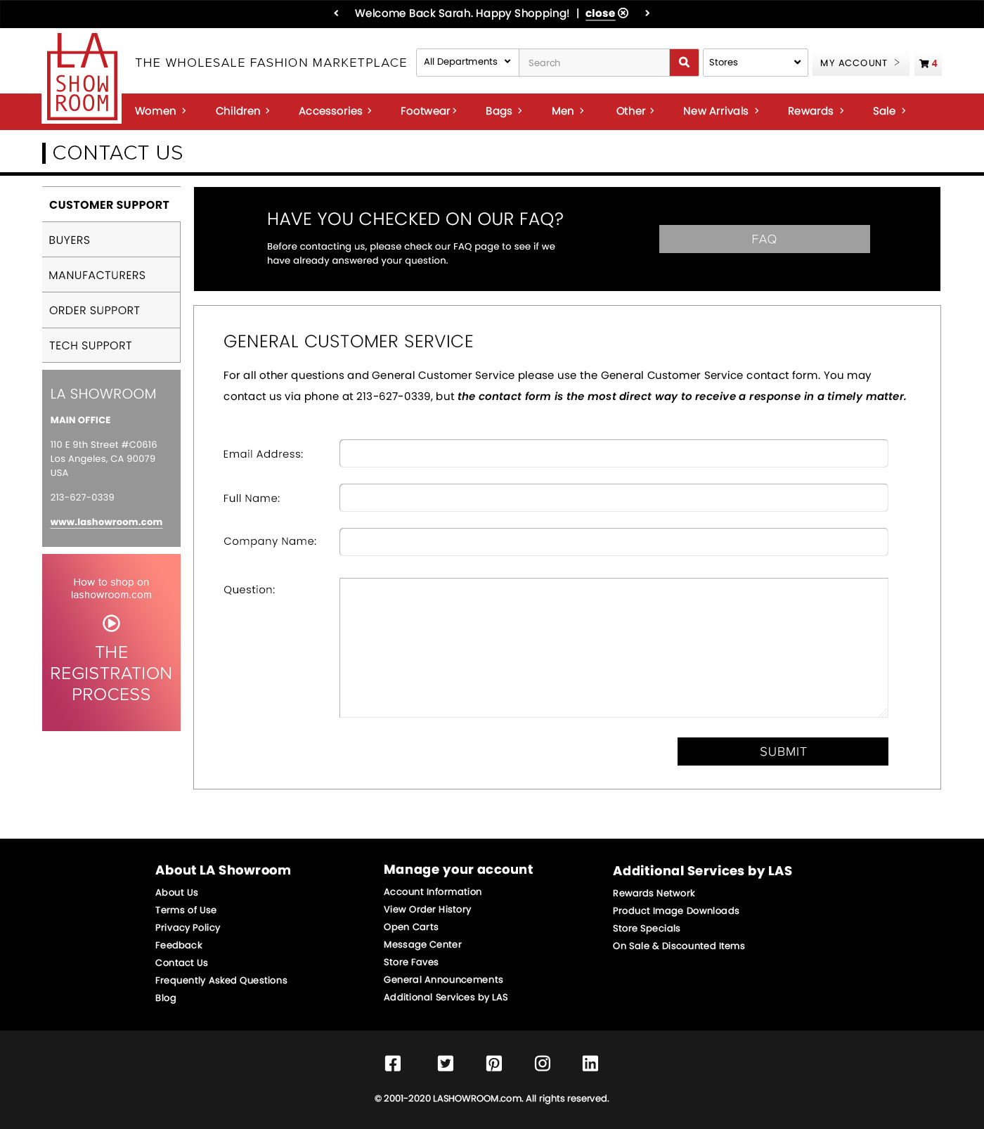
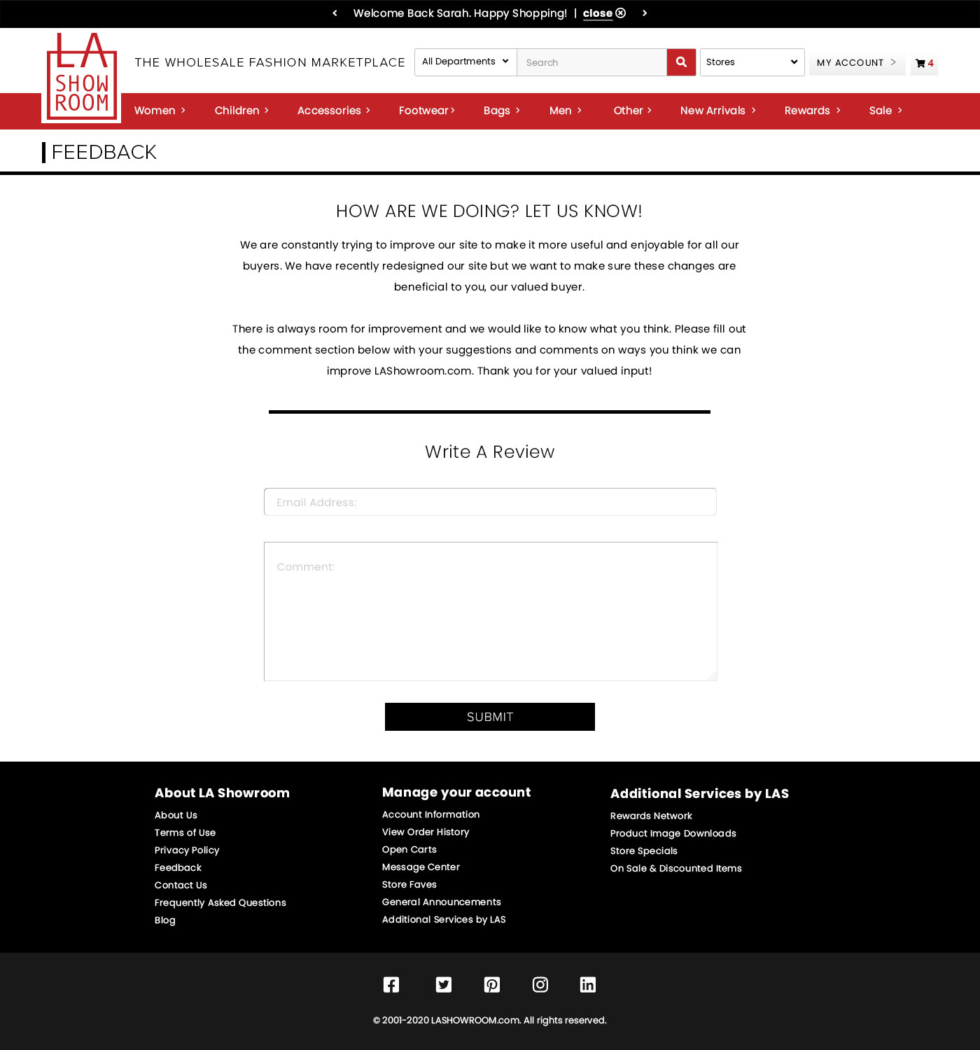
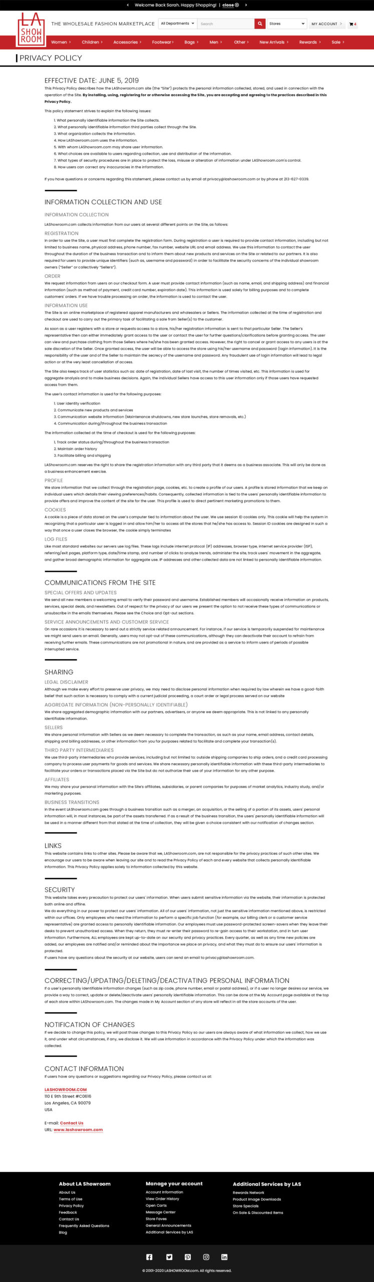
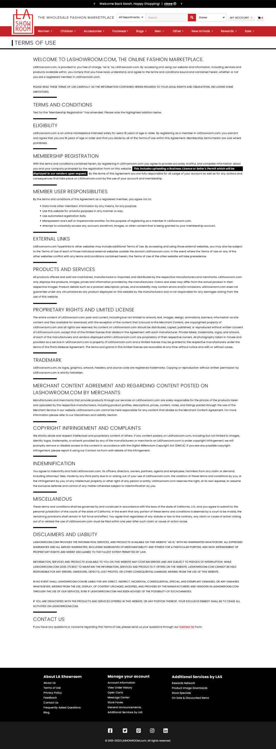
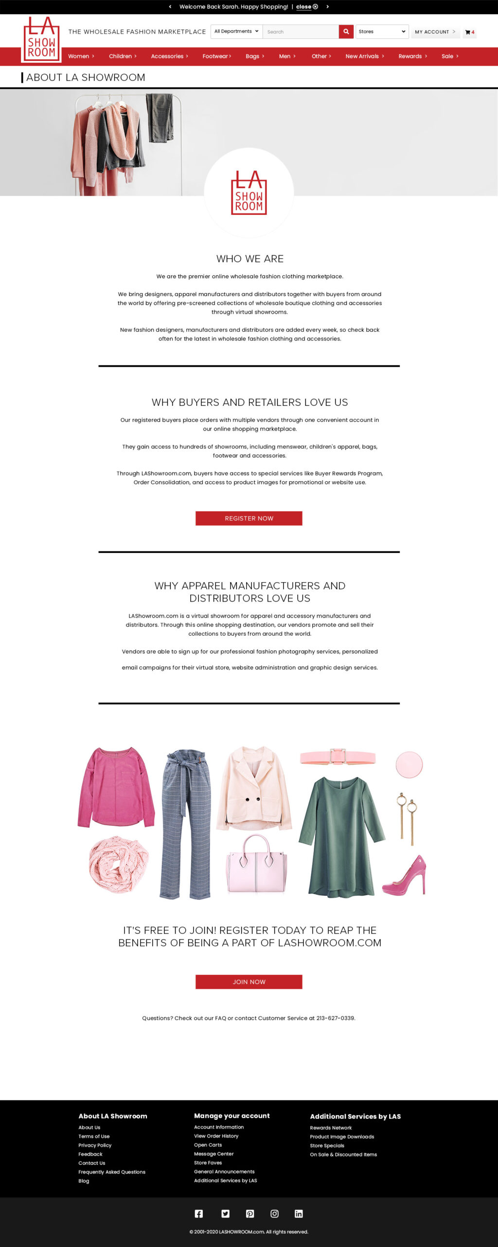
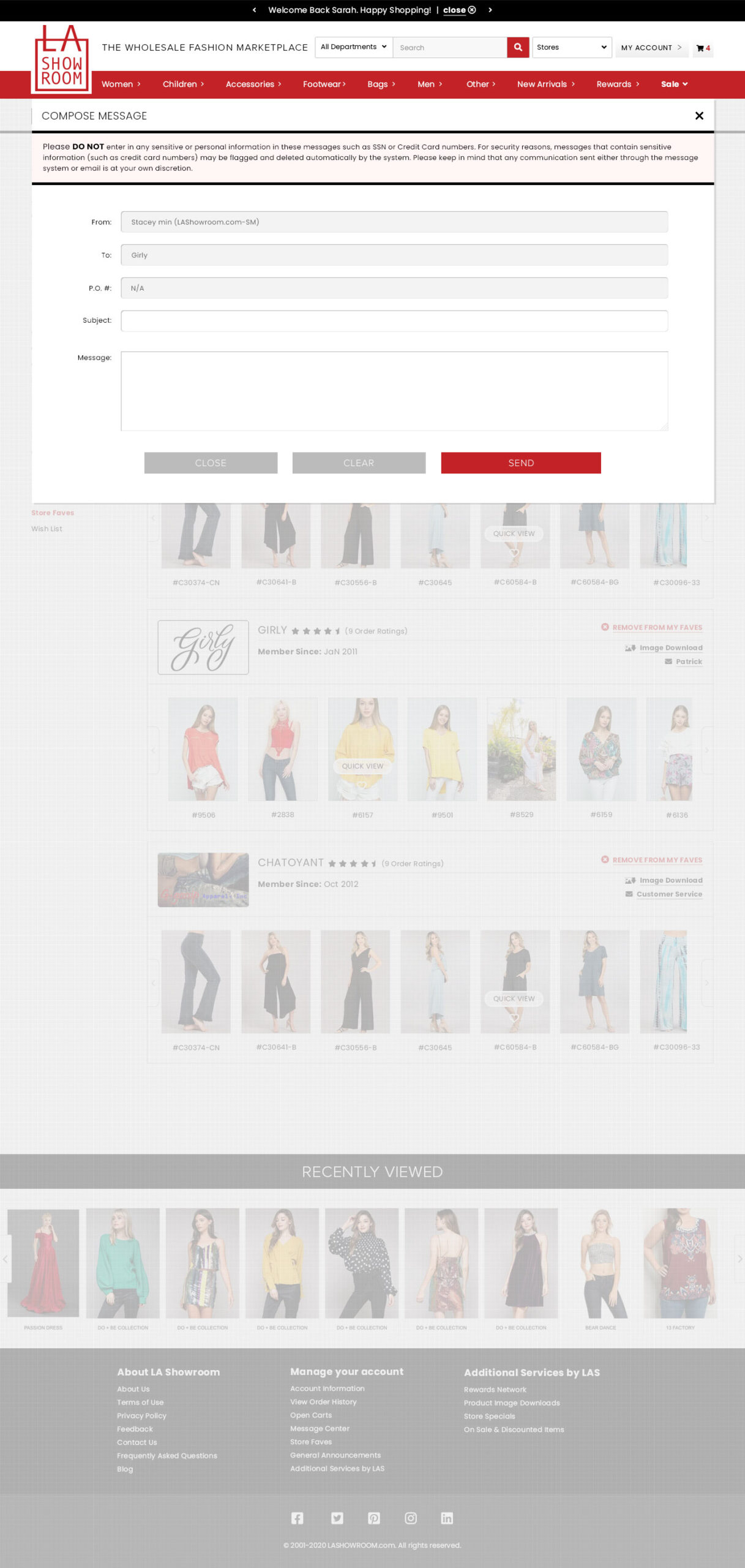
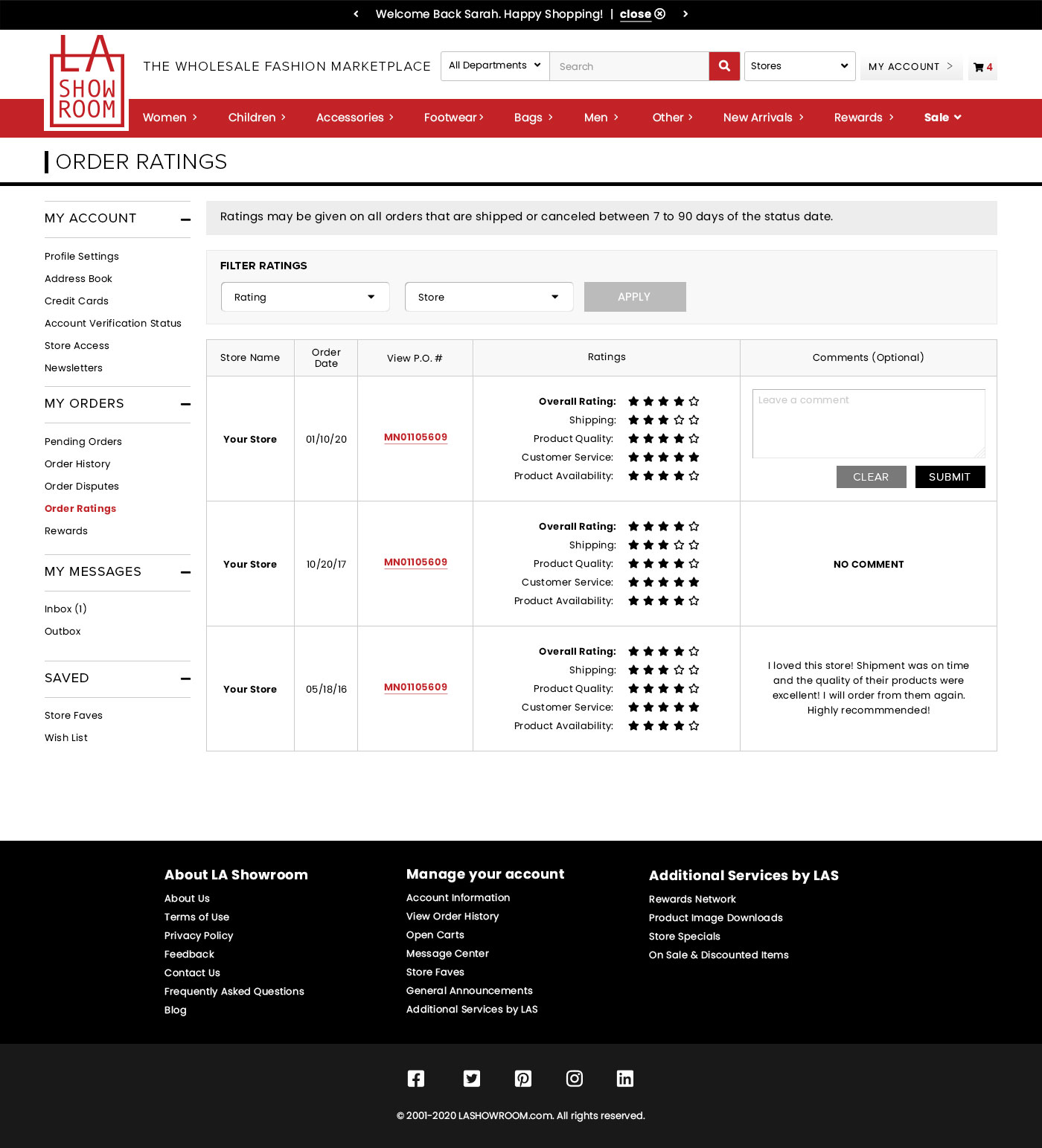
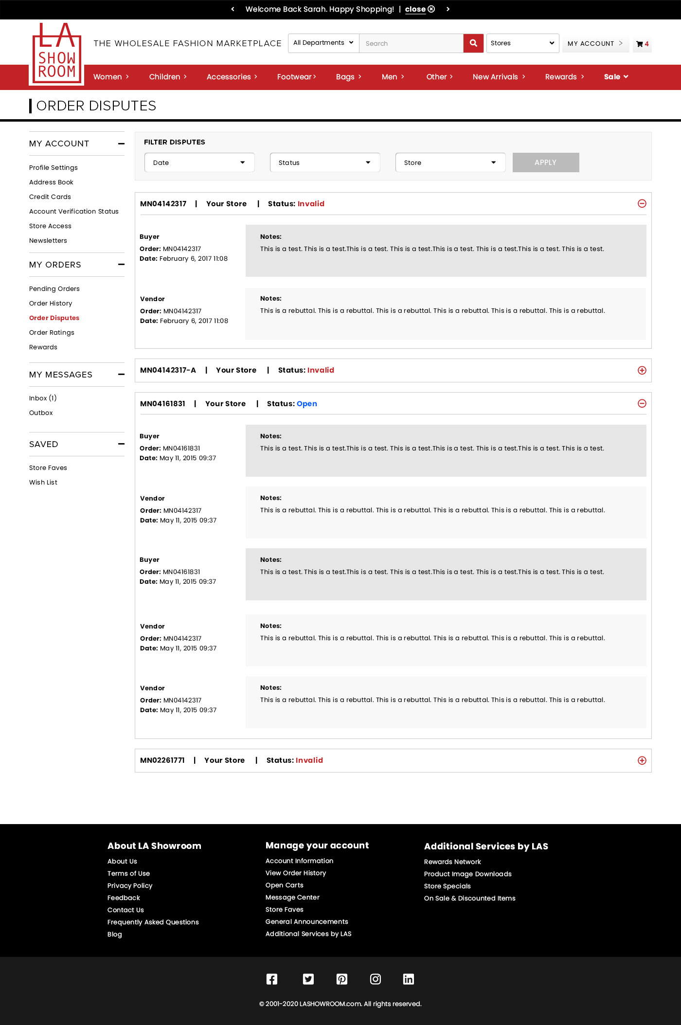
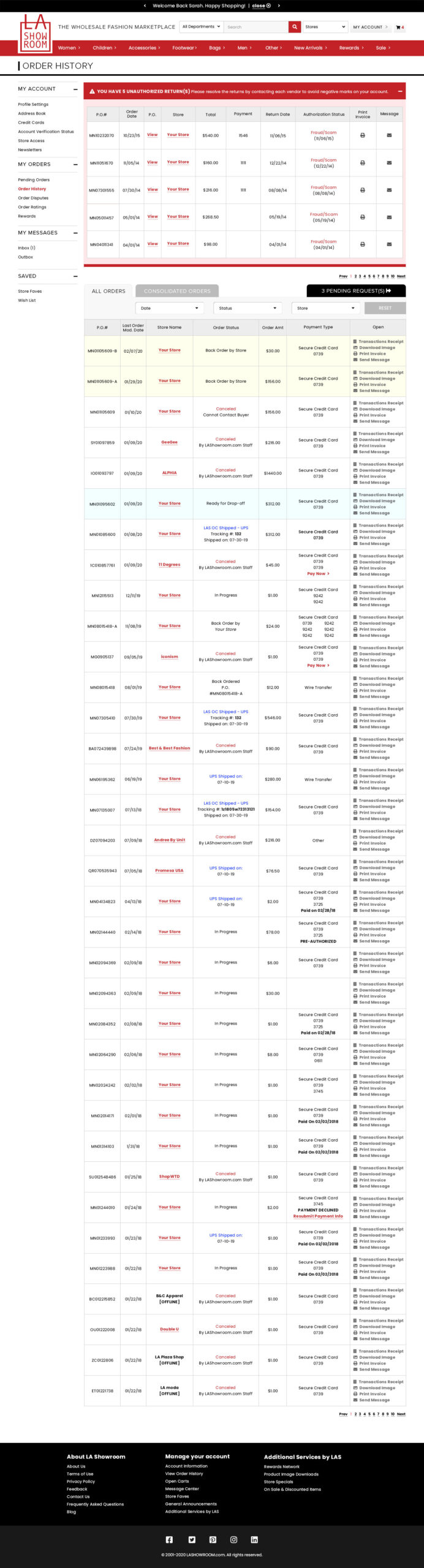
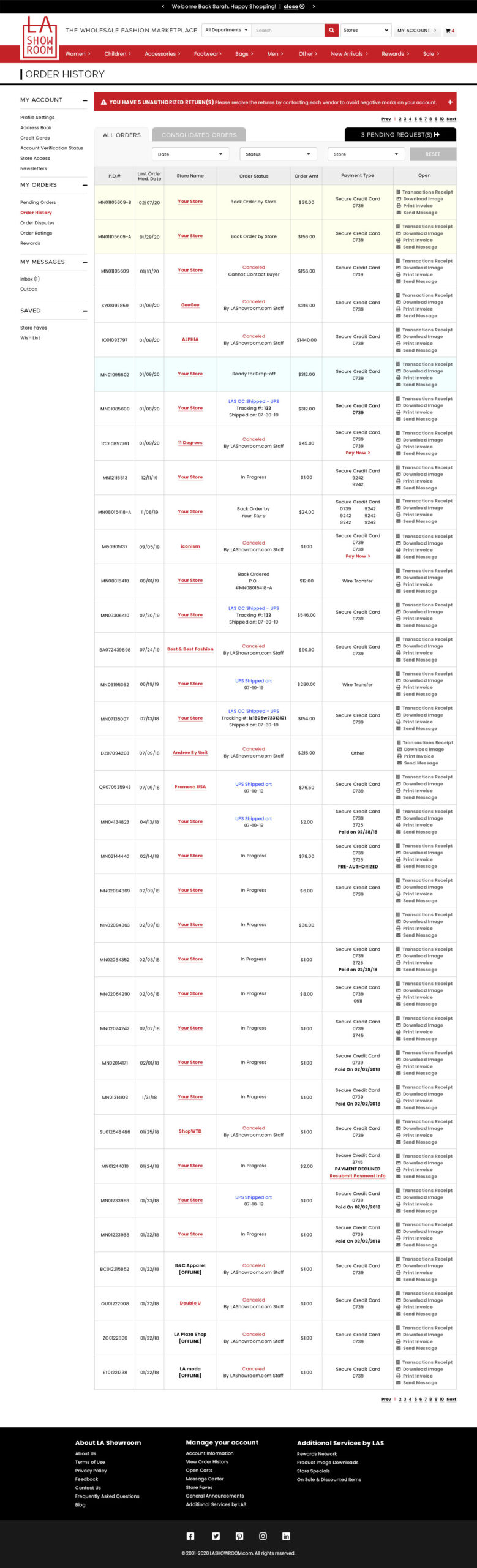
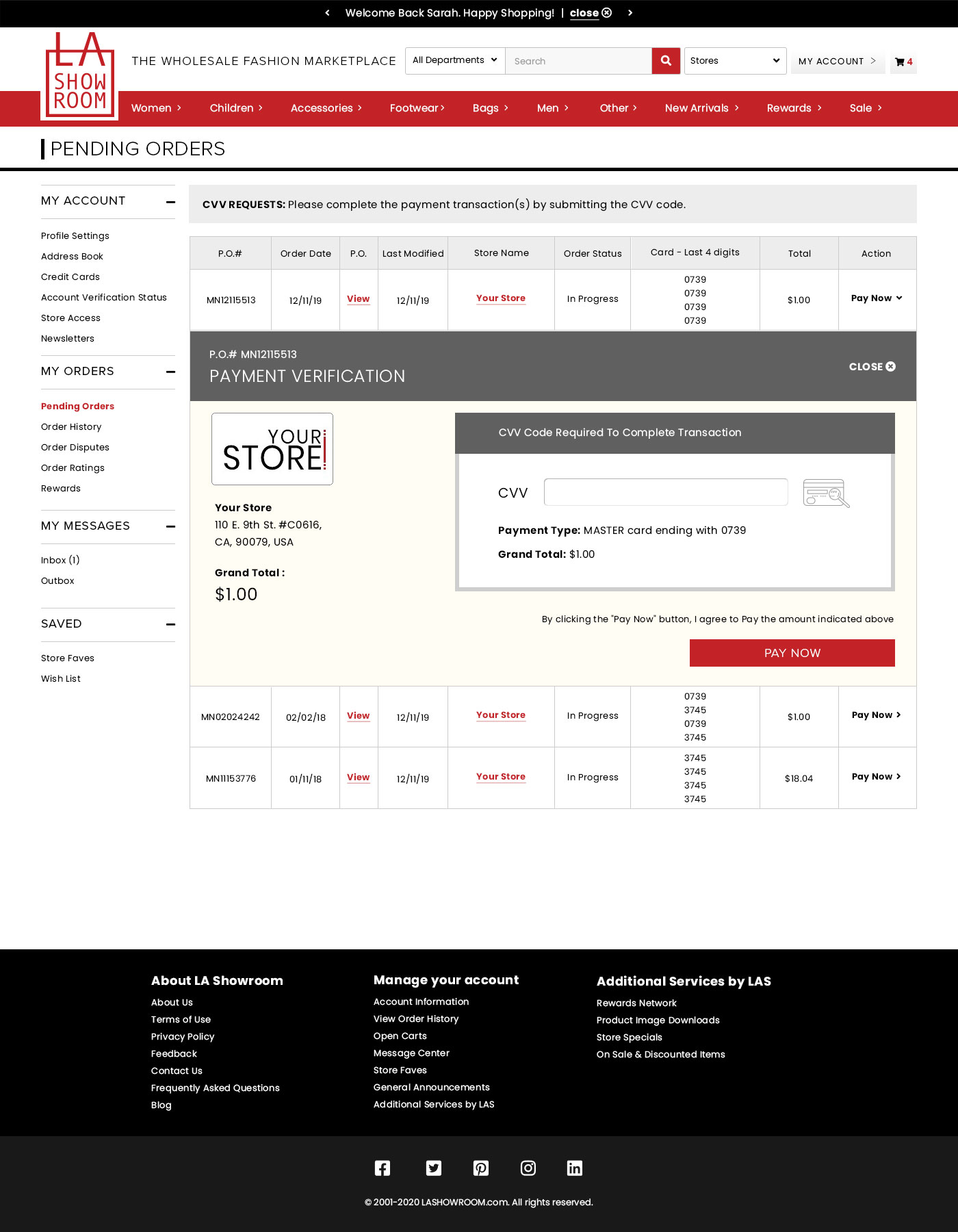
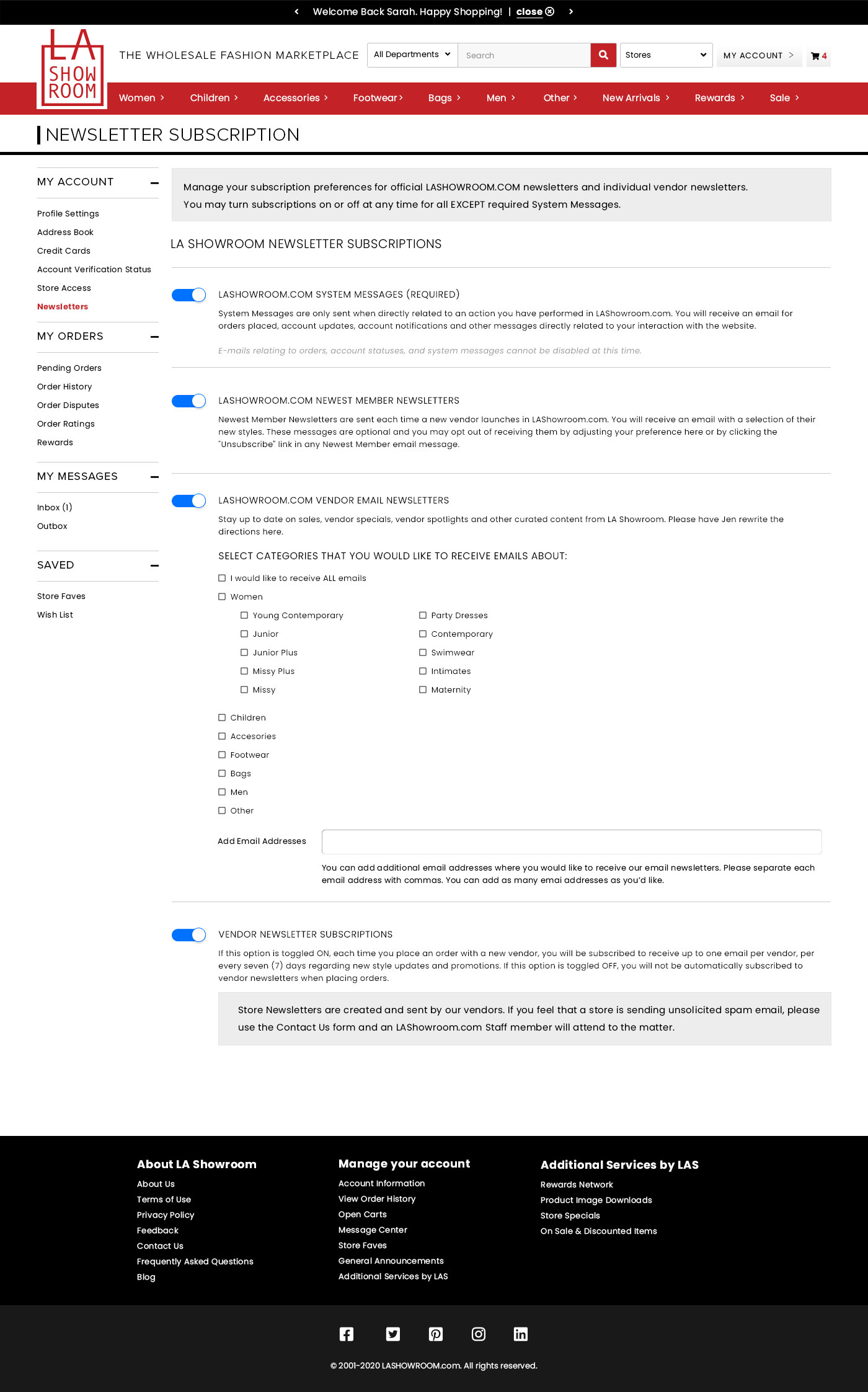
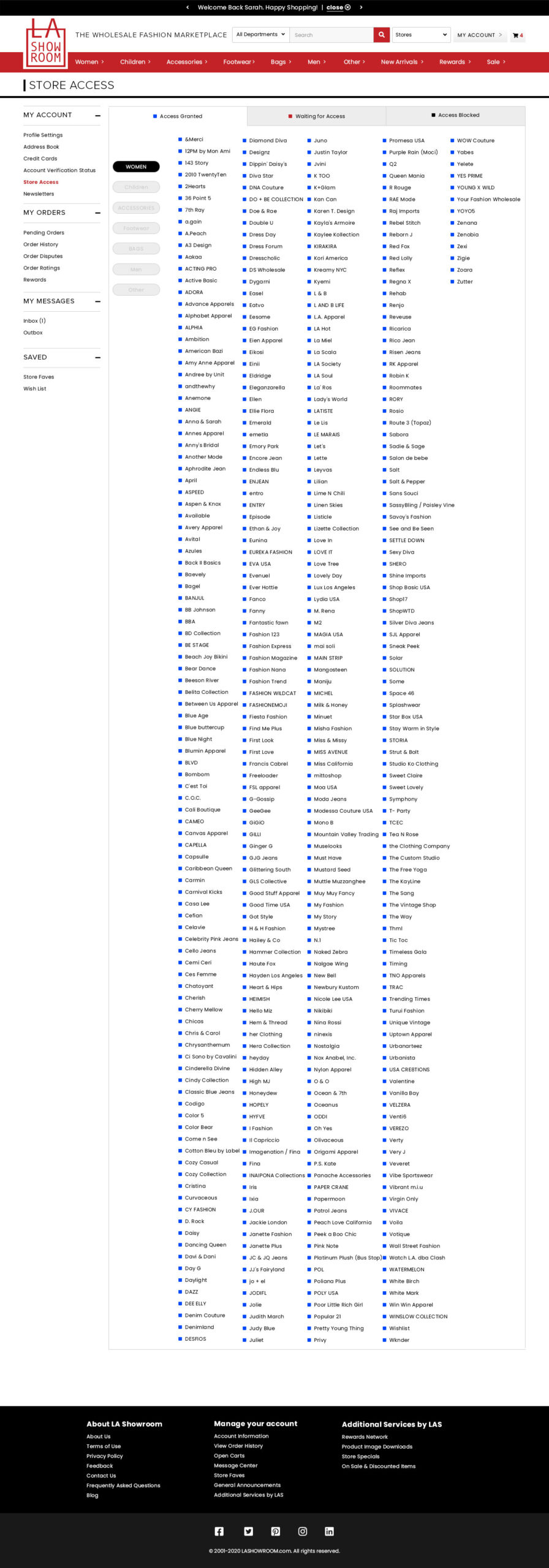
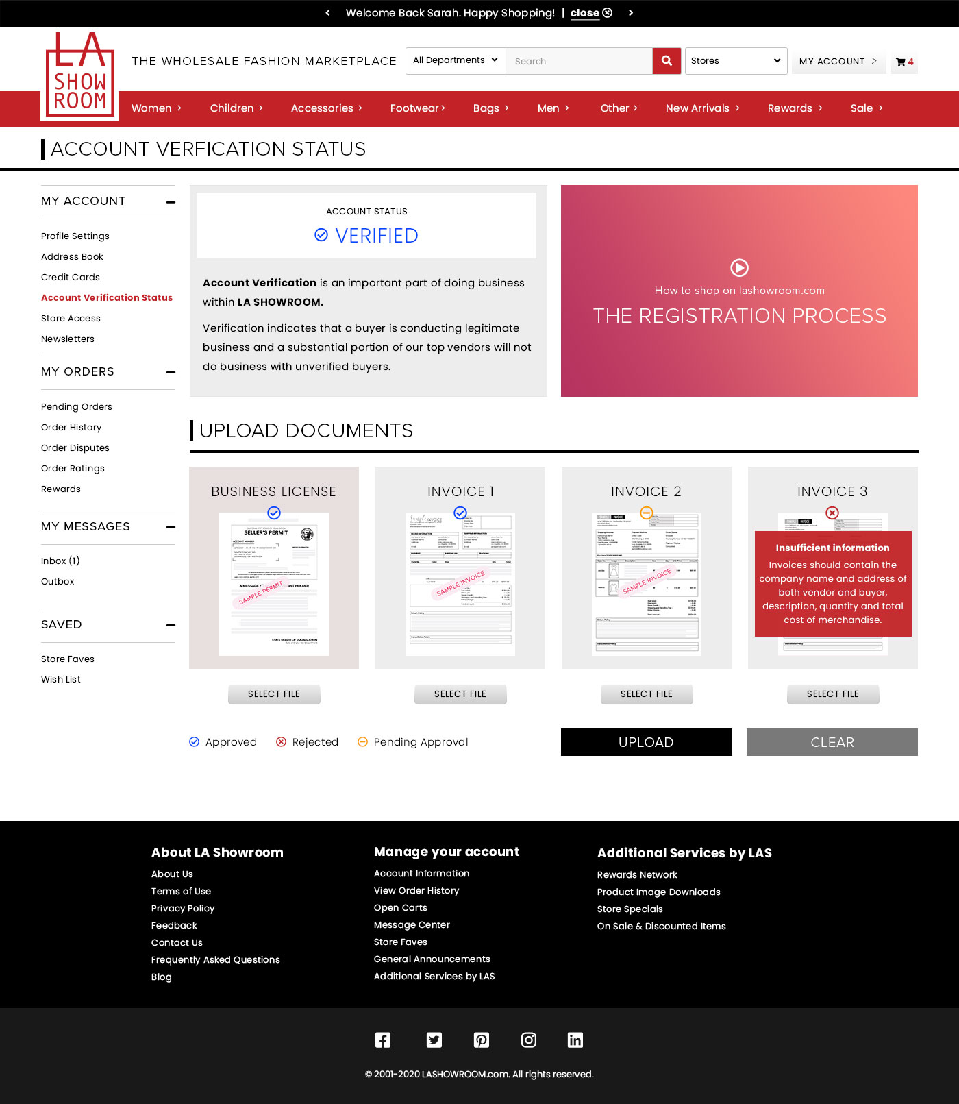
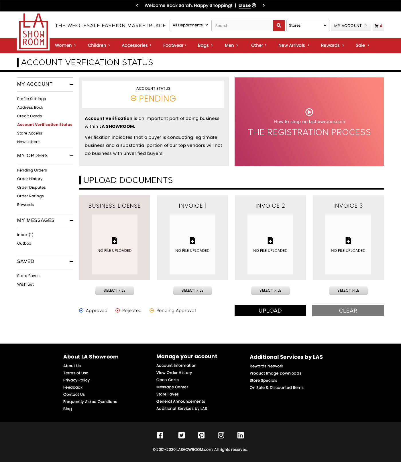
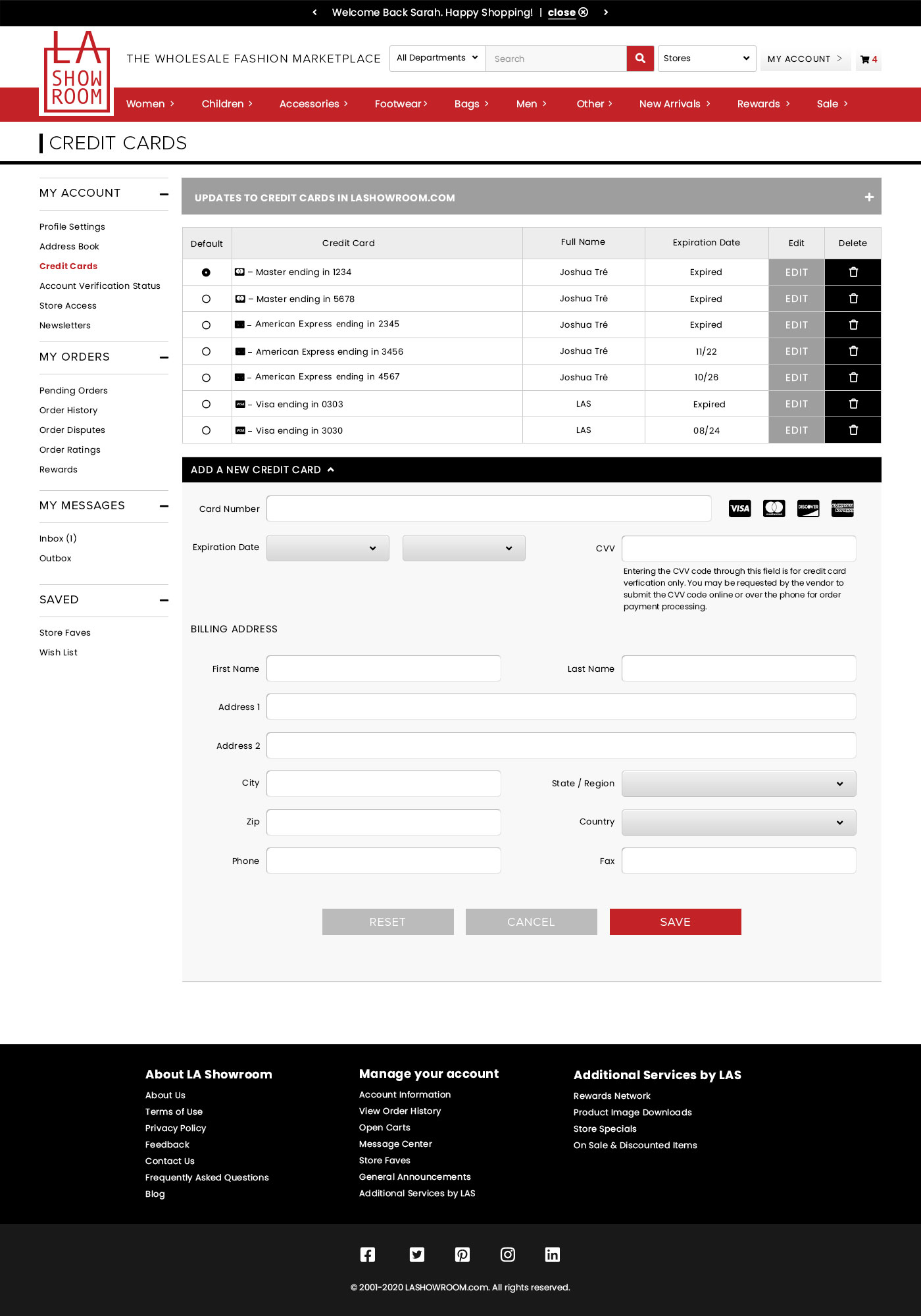
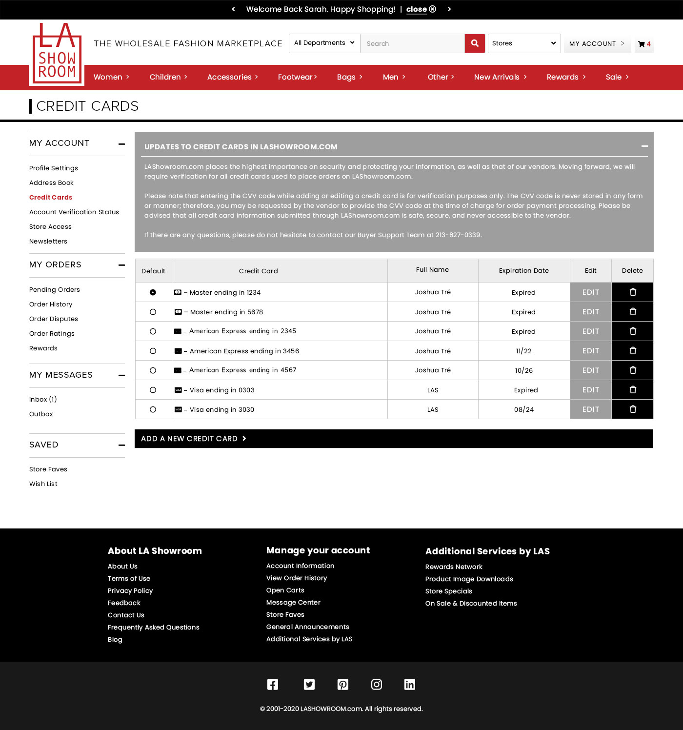
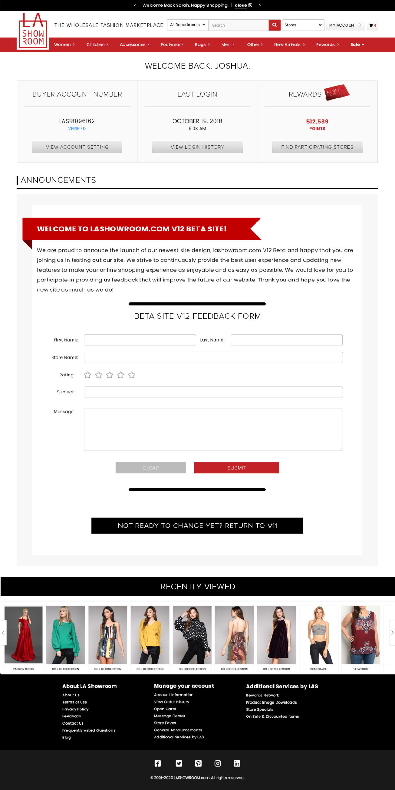
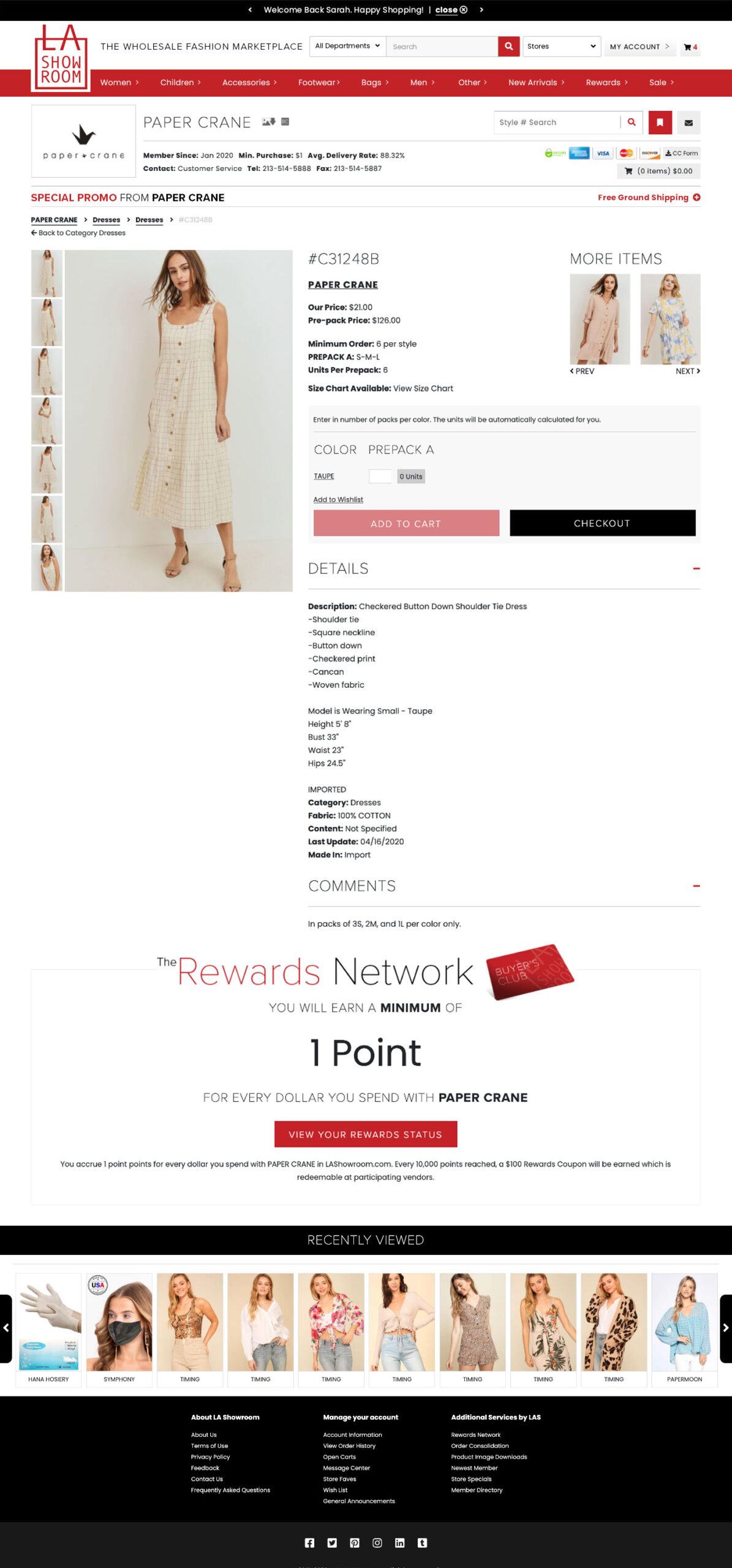
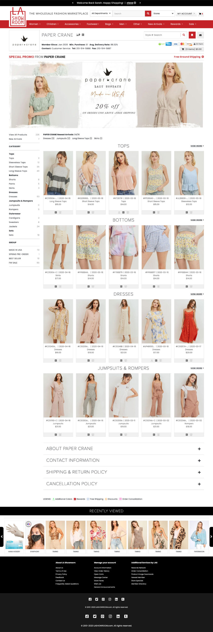
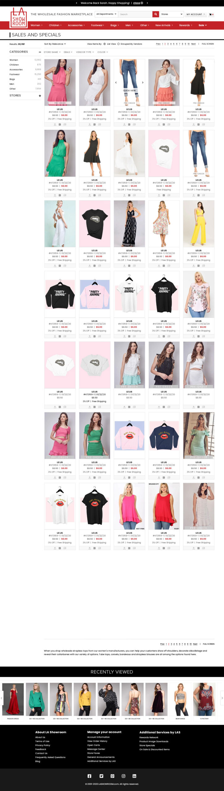
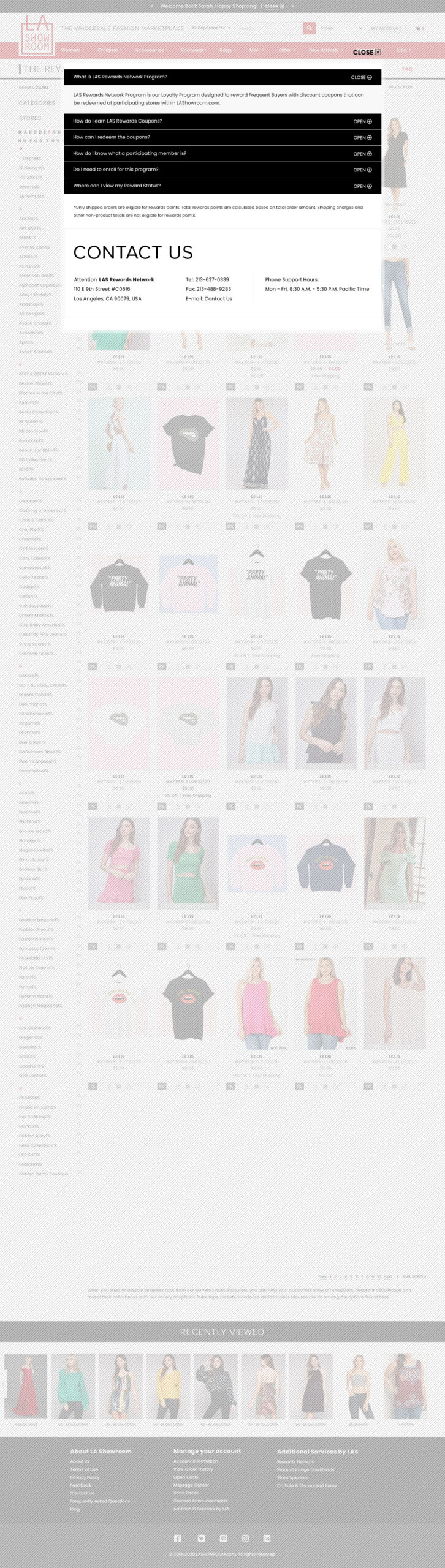
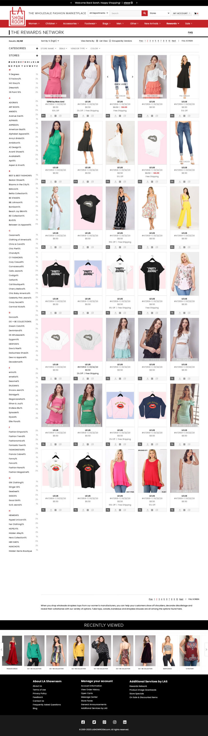
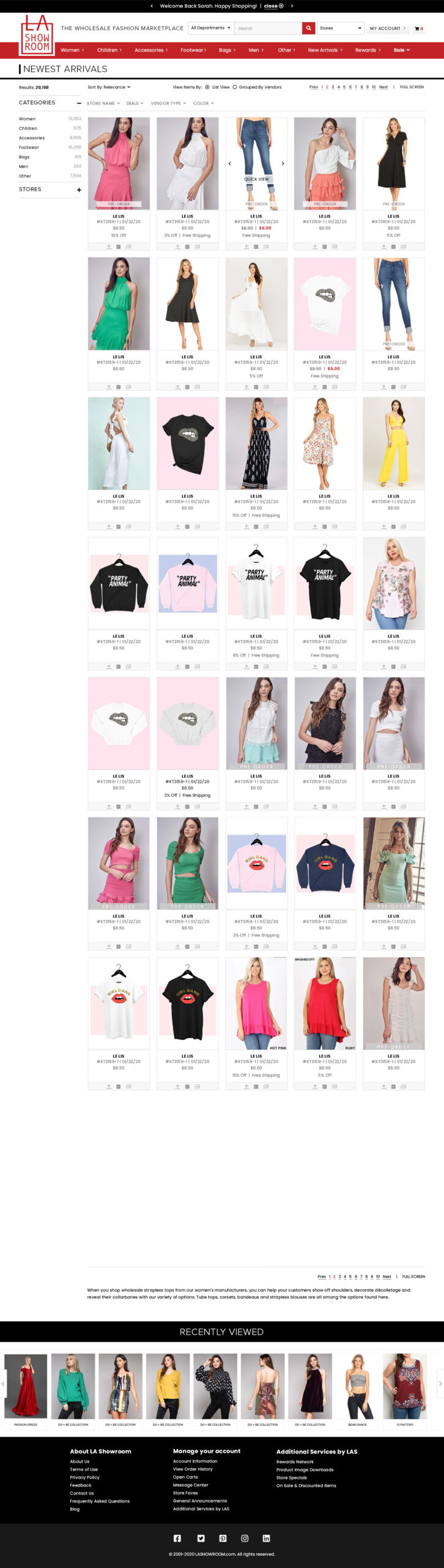
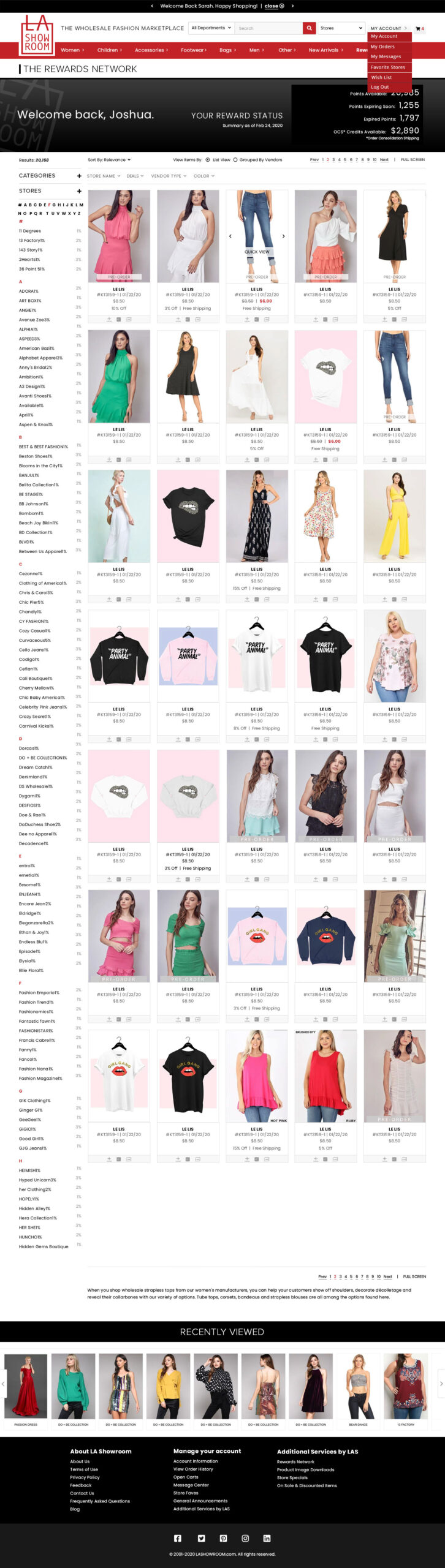
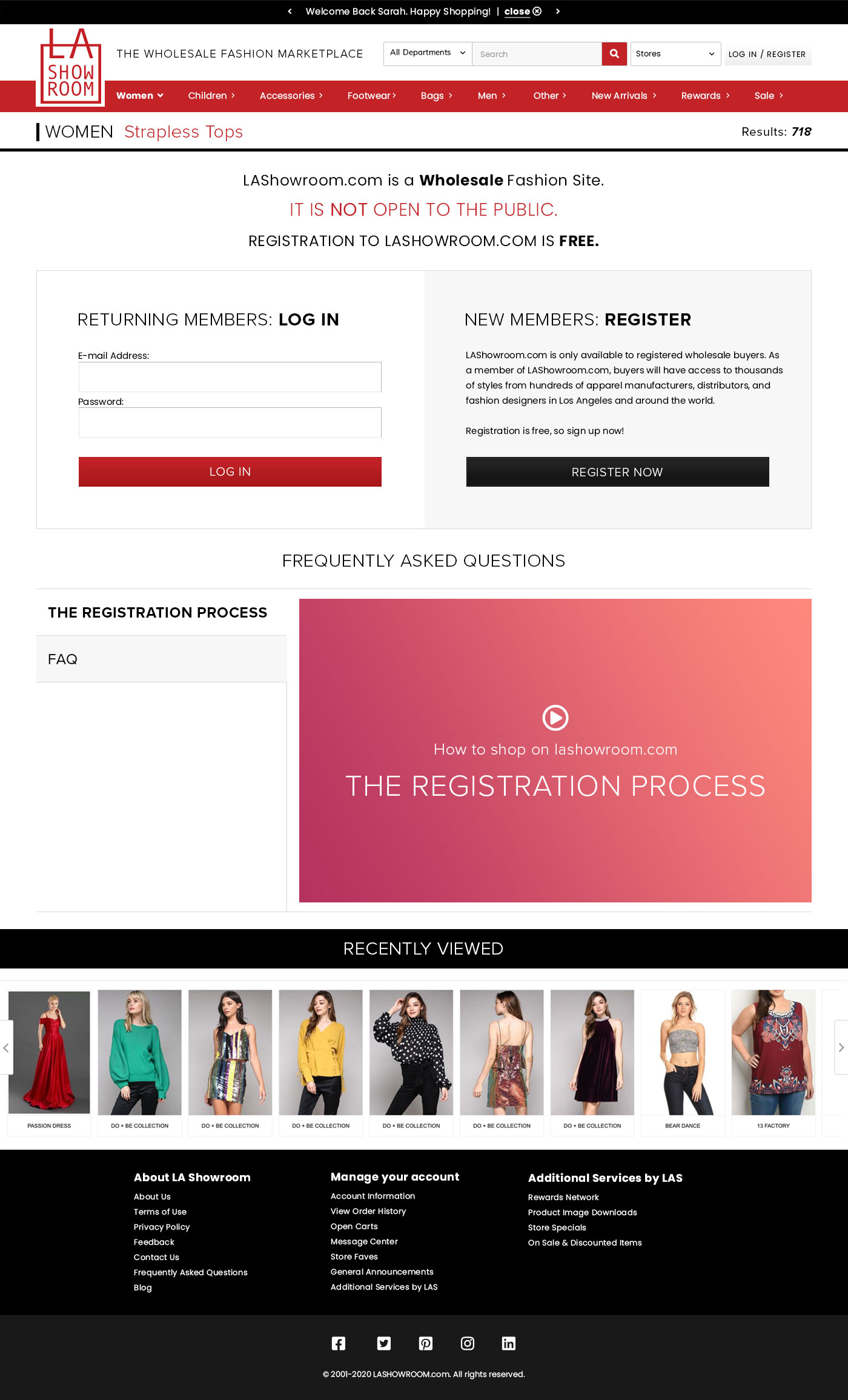
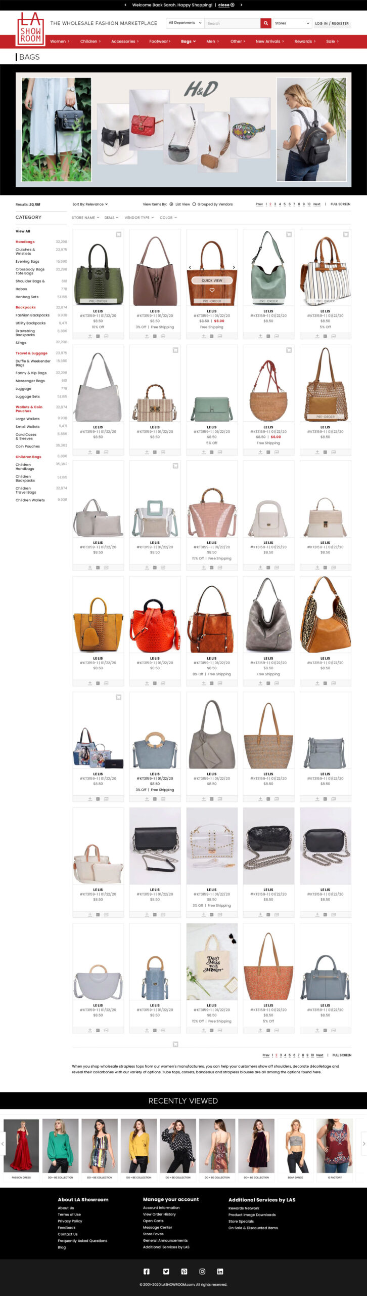
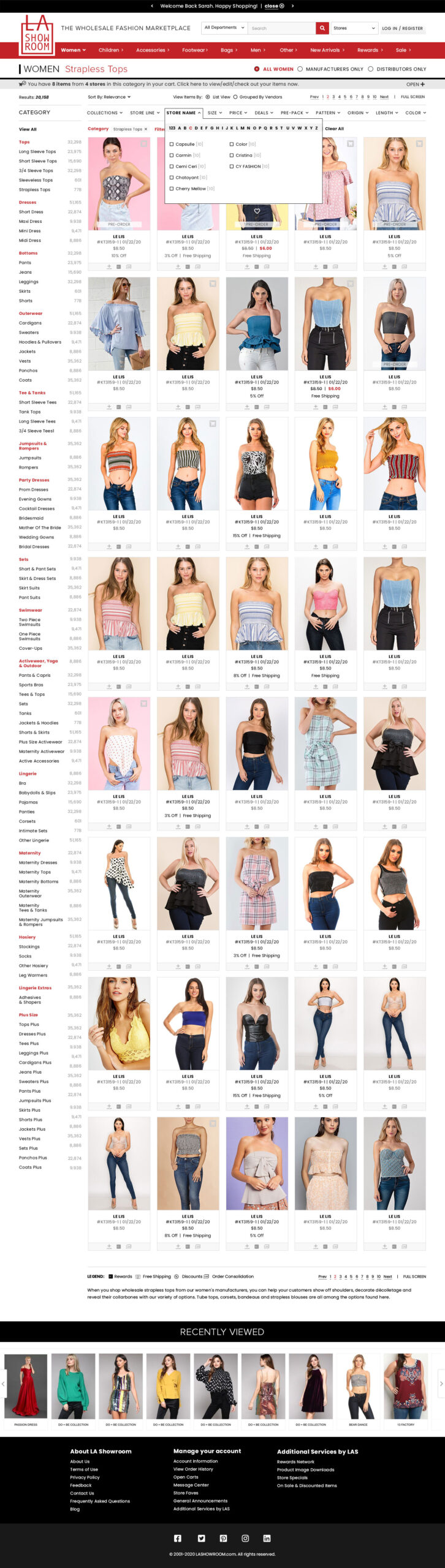
The Challenges

Interface
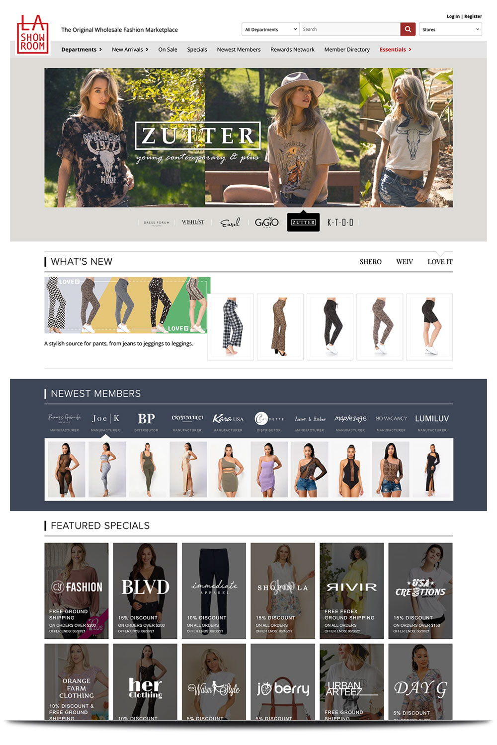
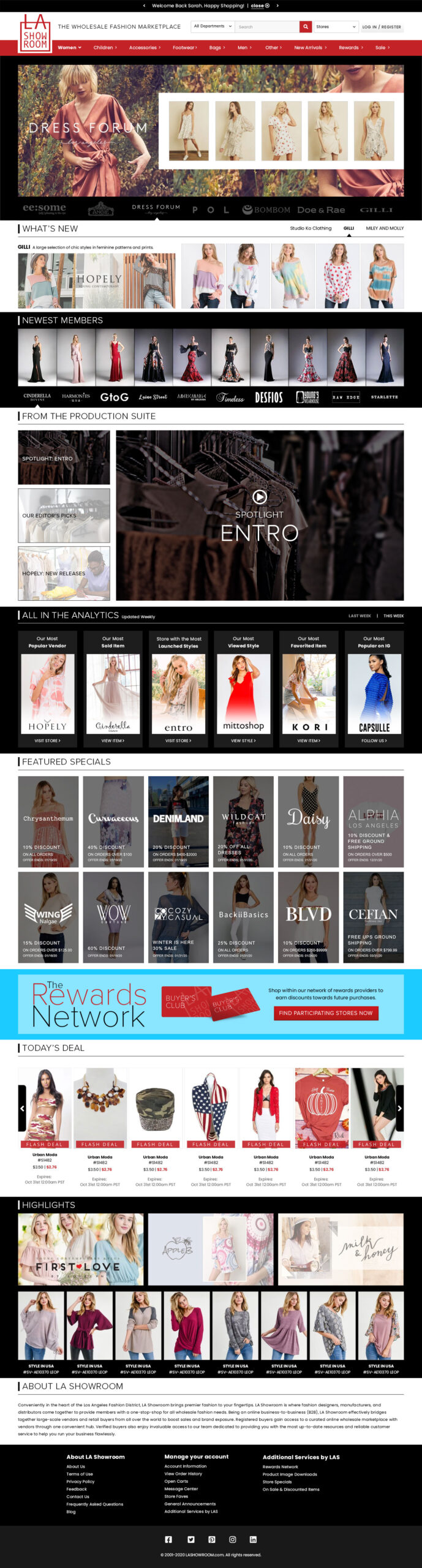
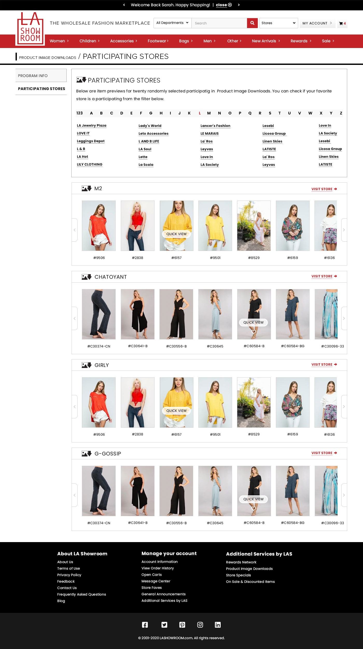
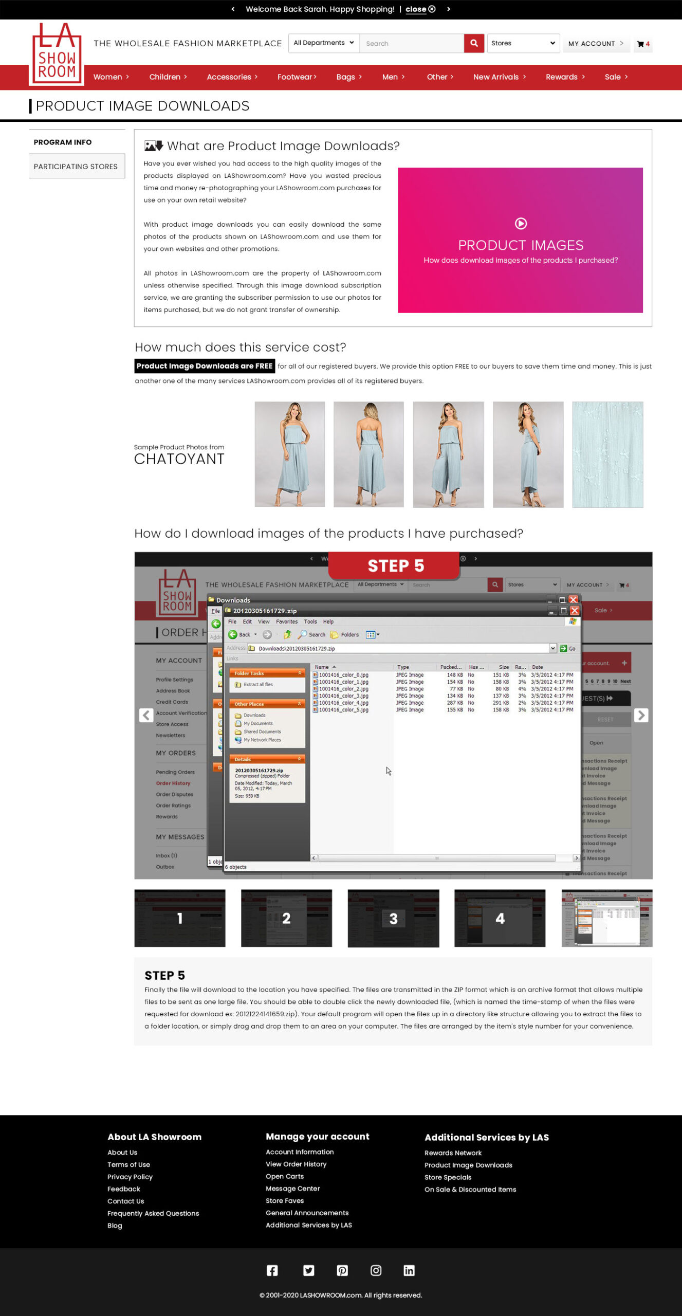
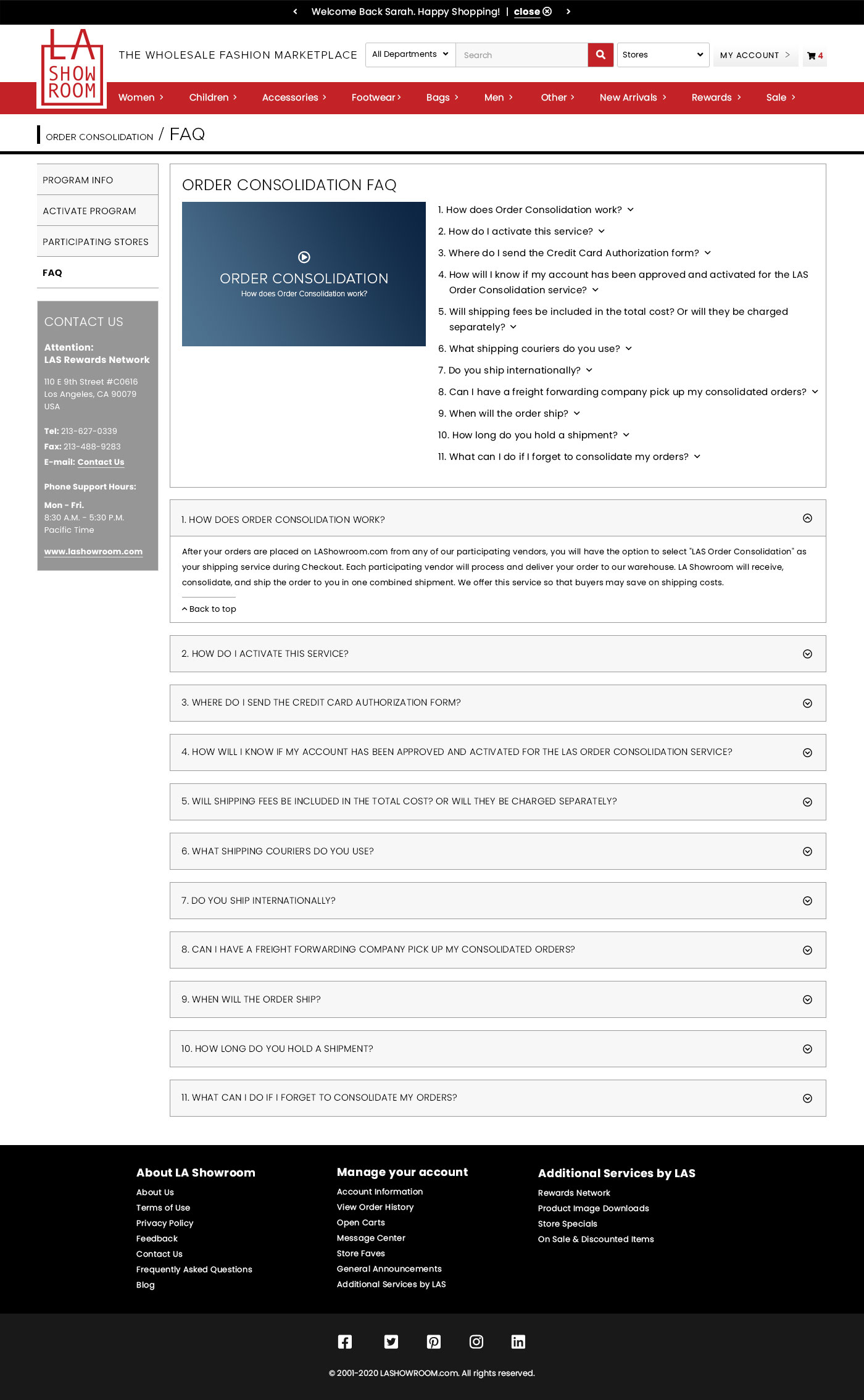
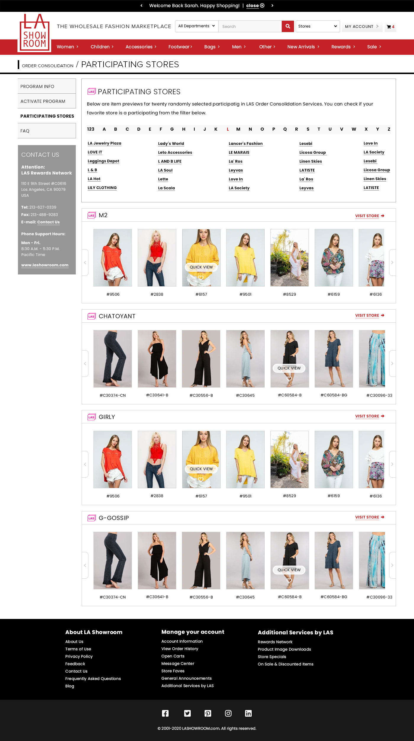
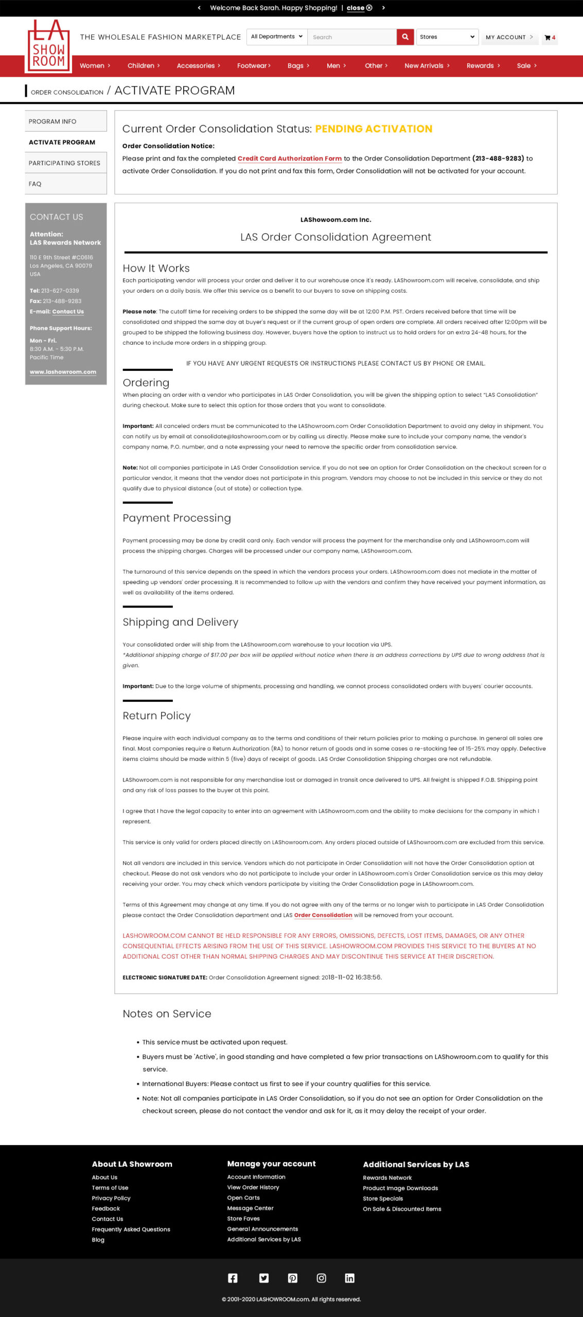
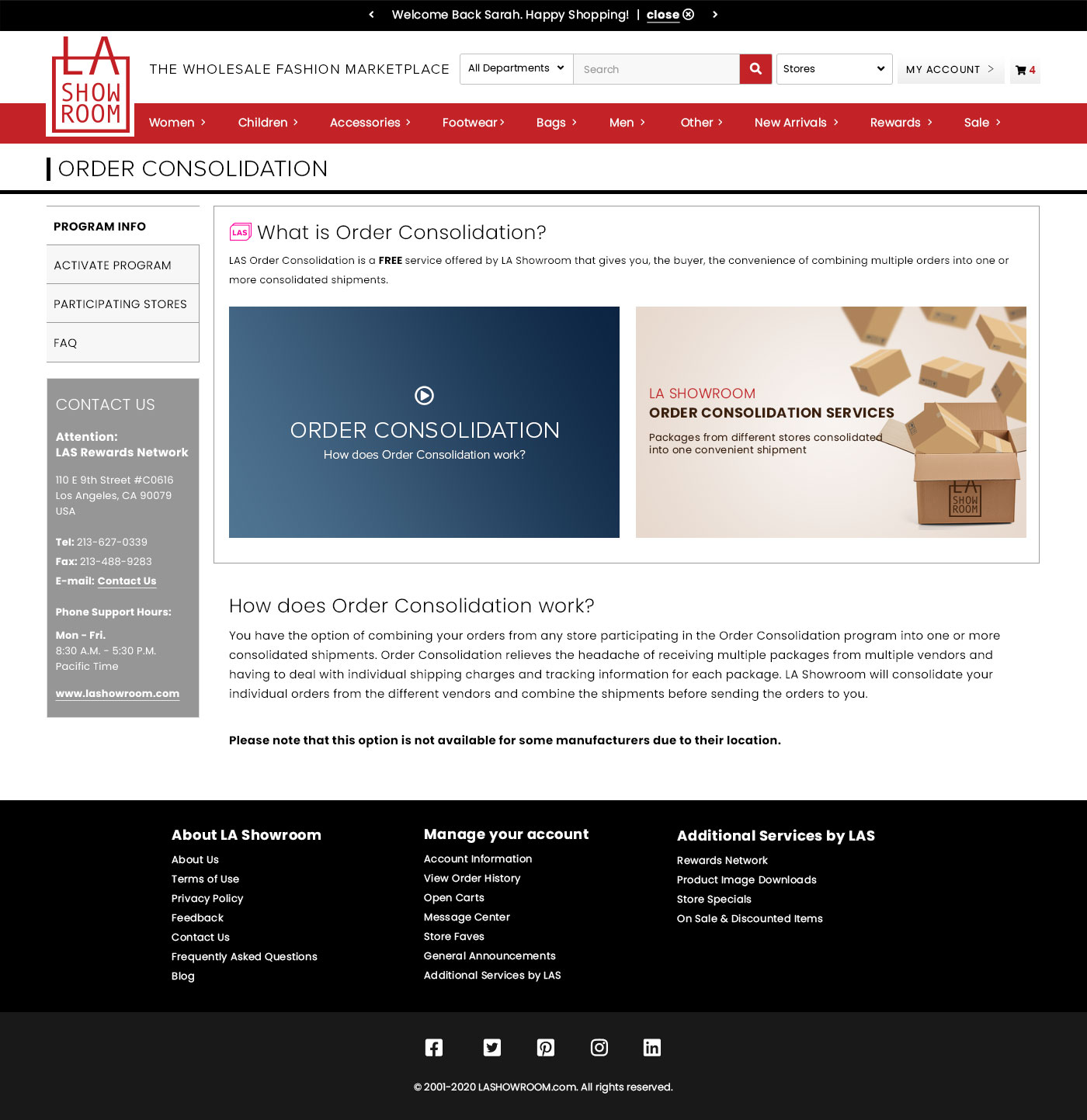
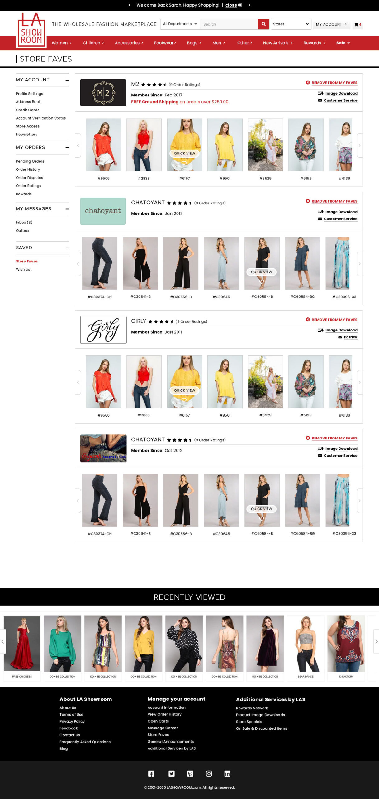
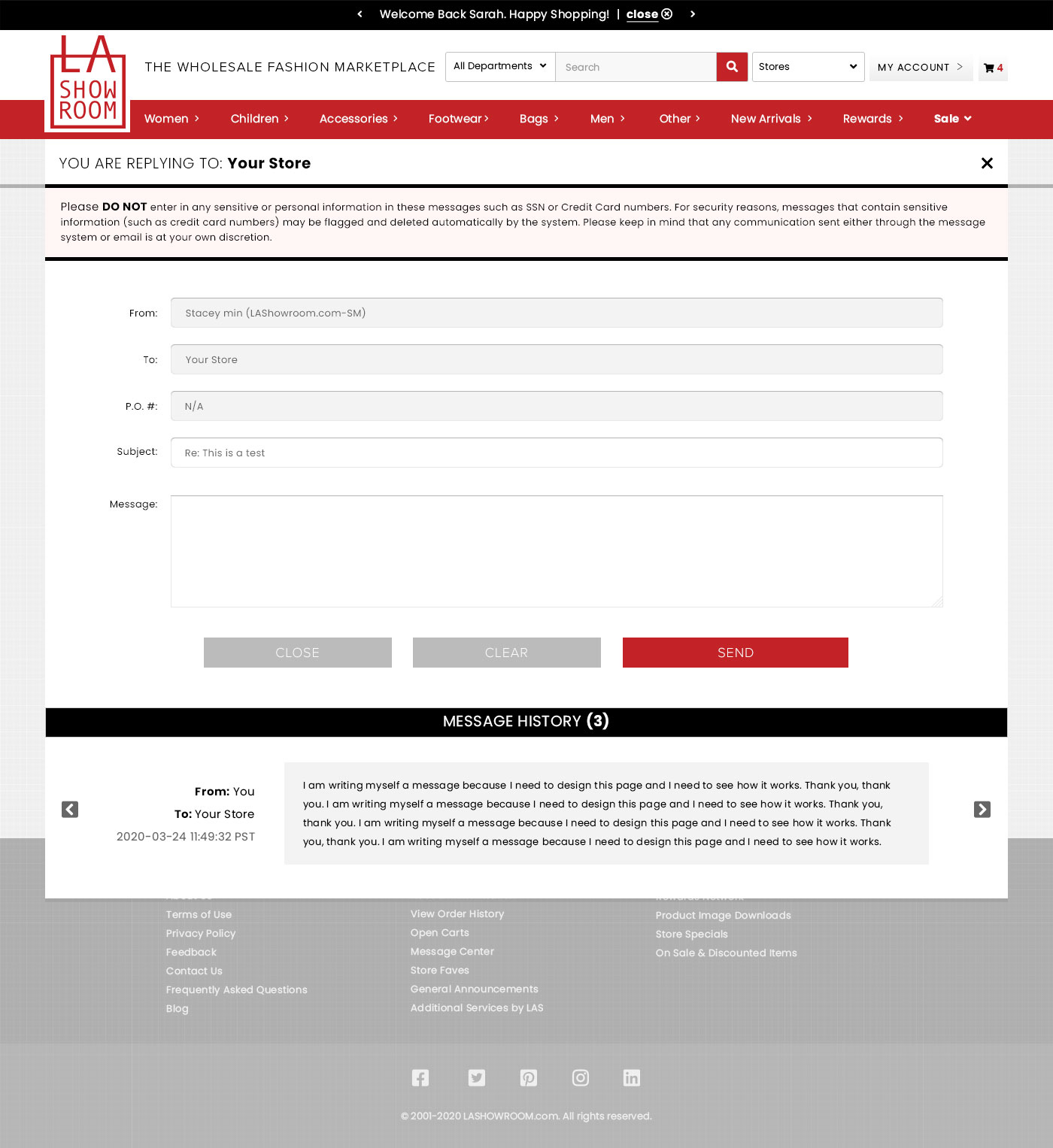
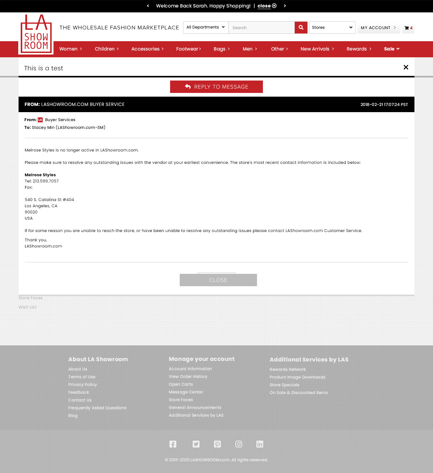
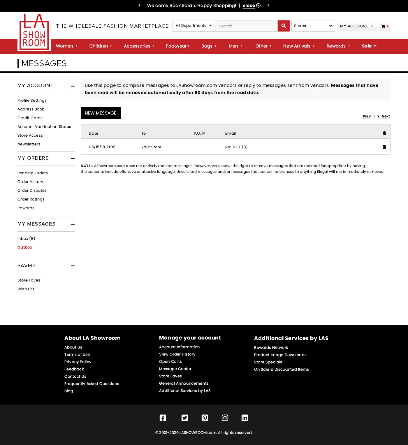
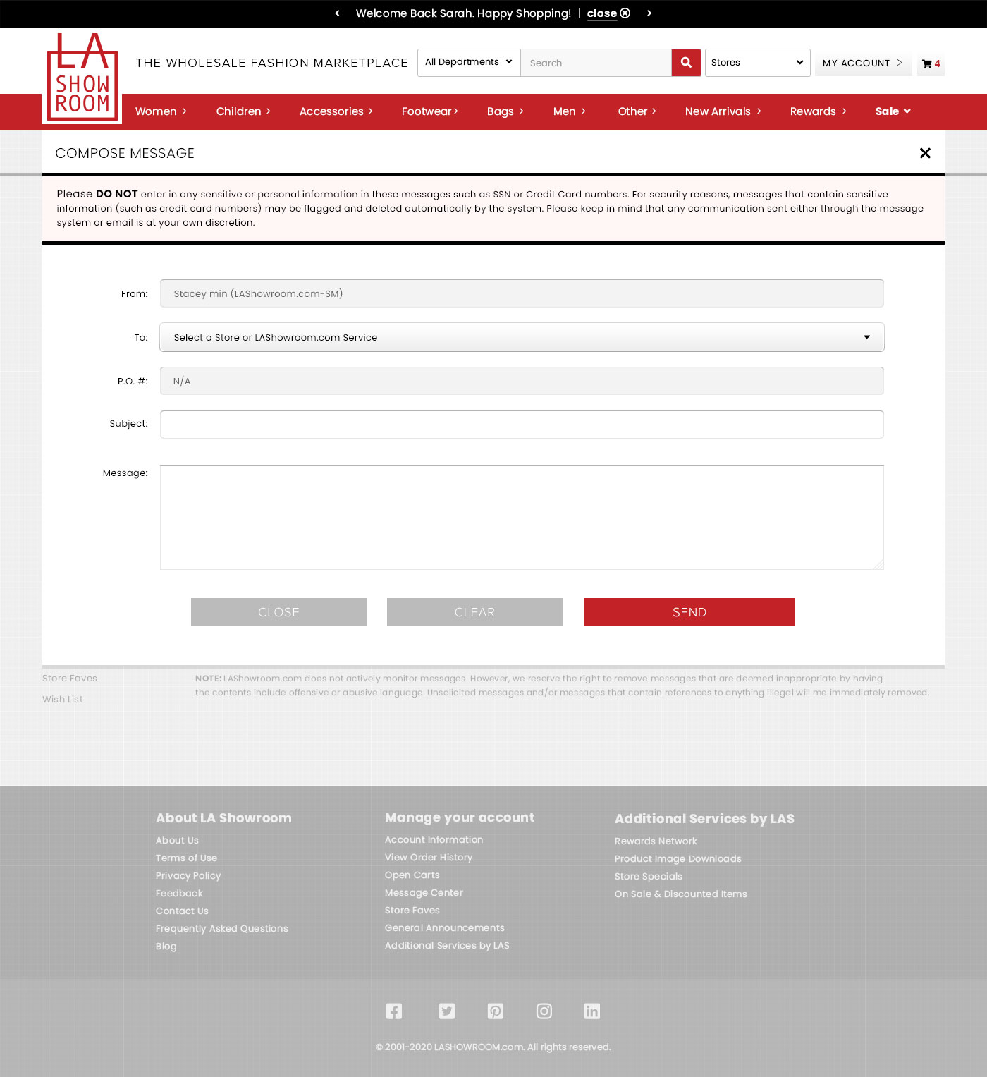
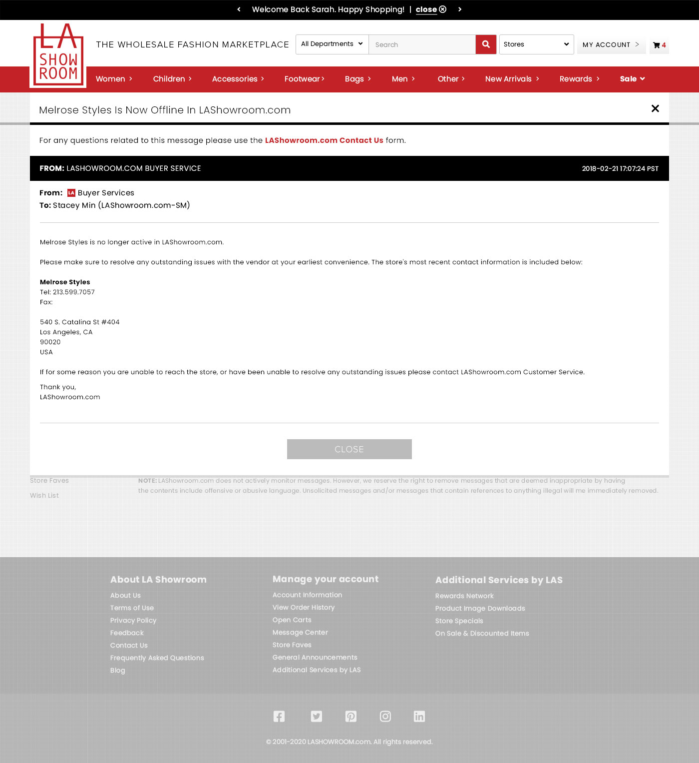
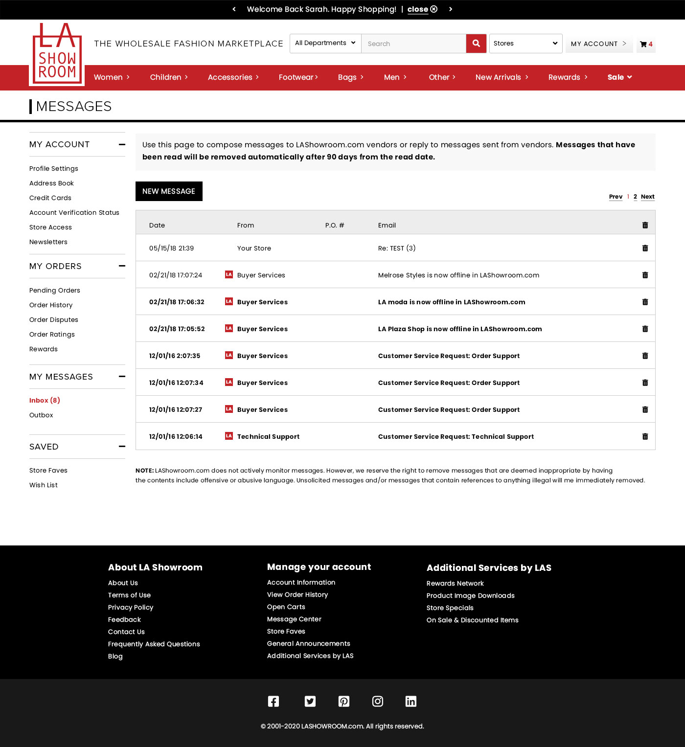
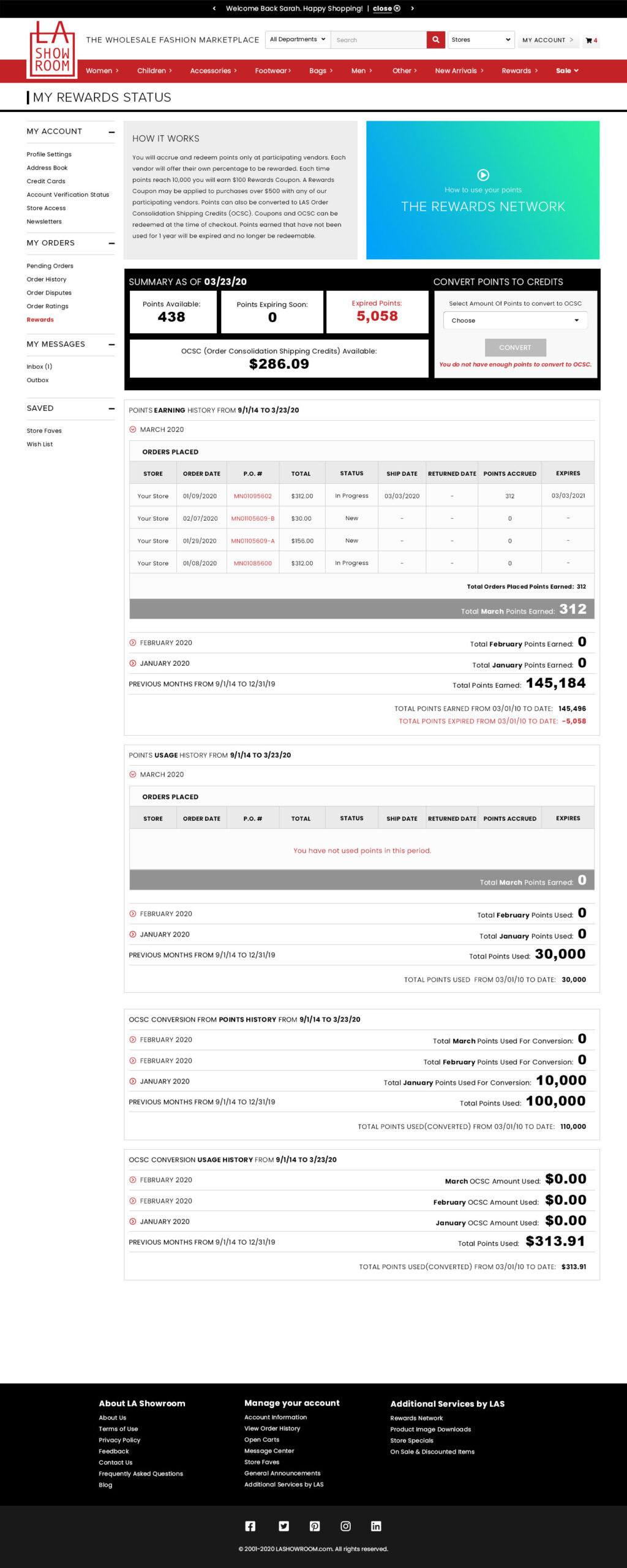
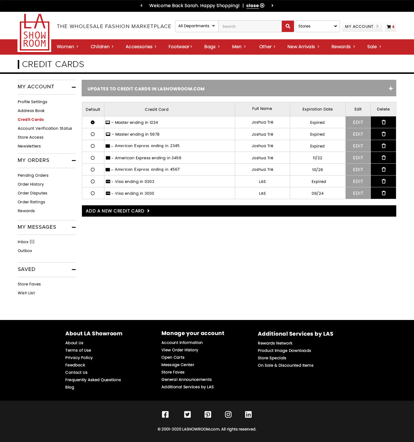
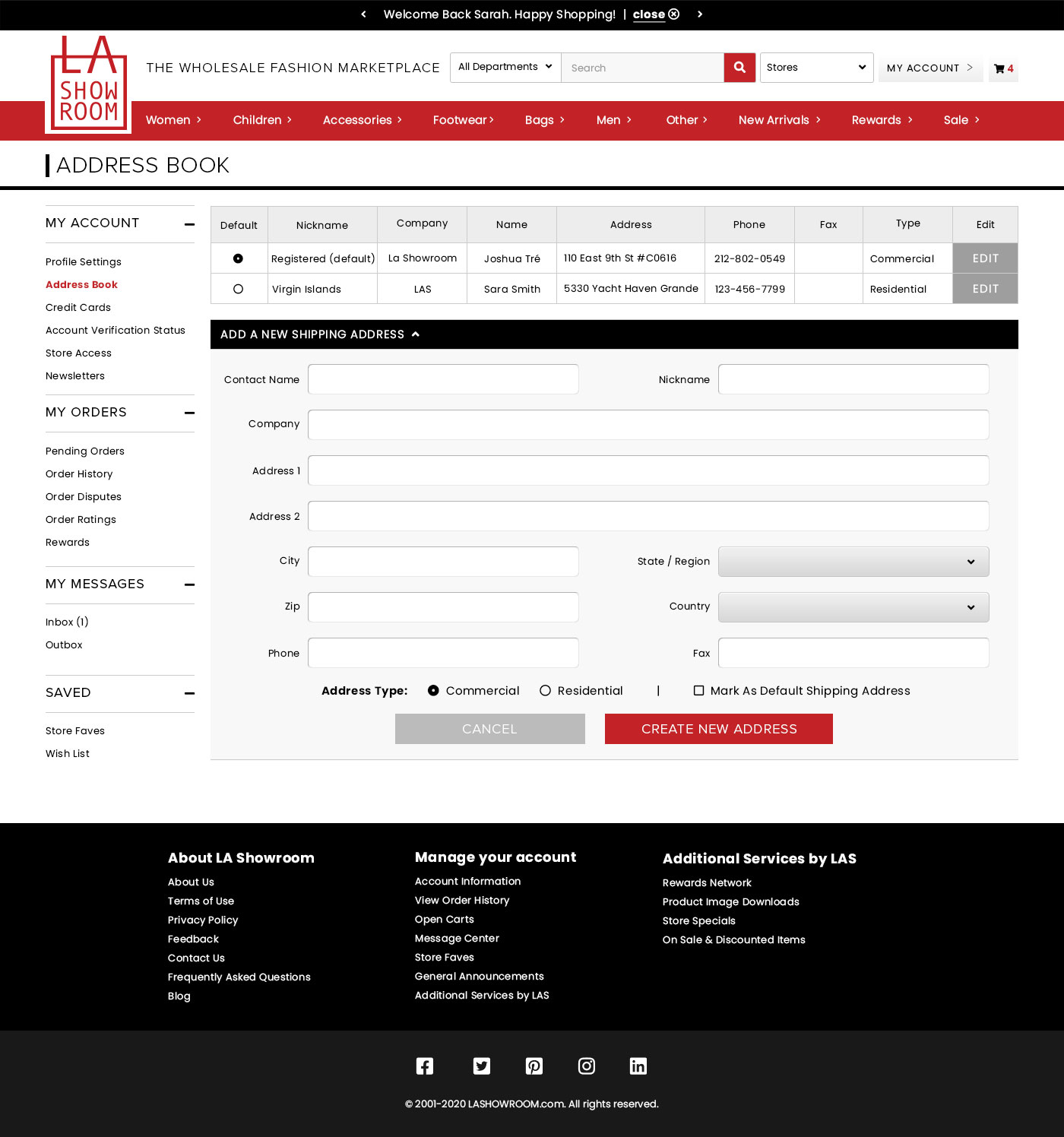
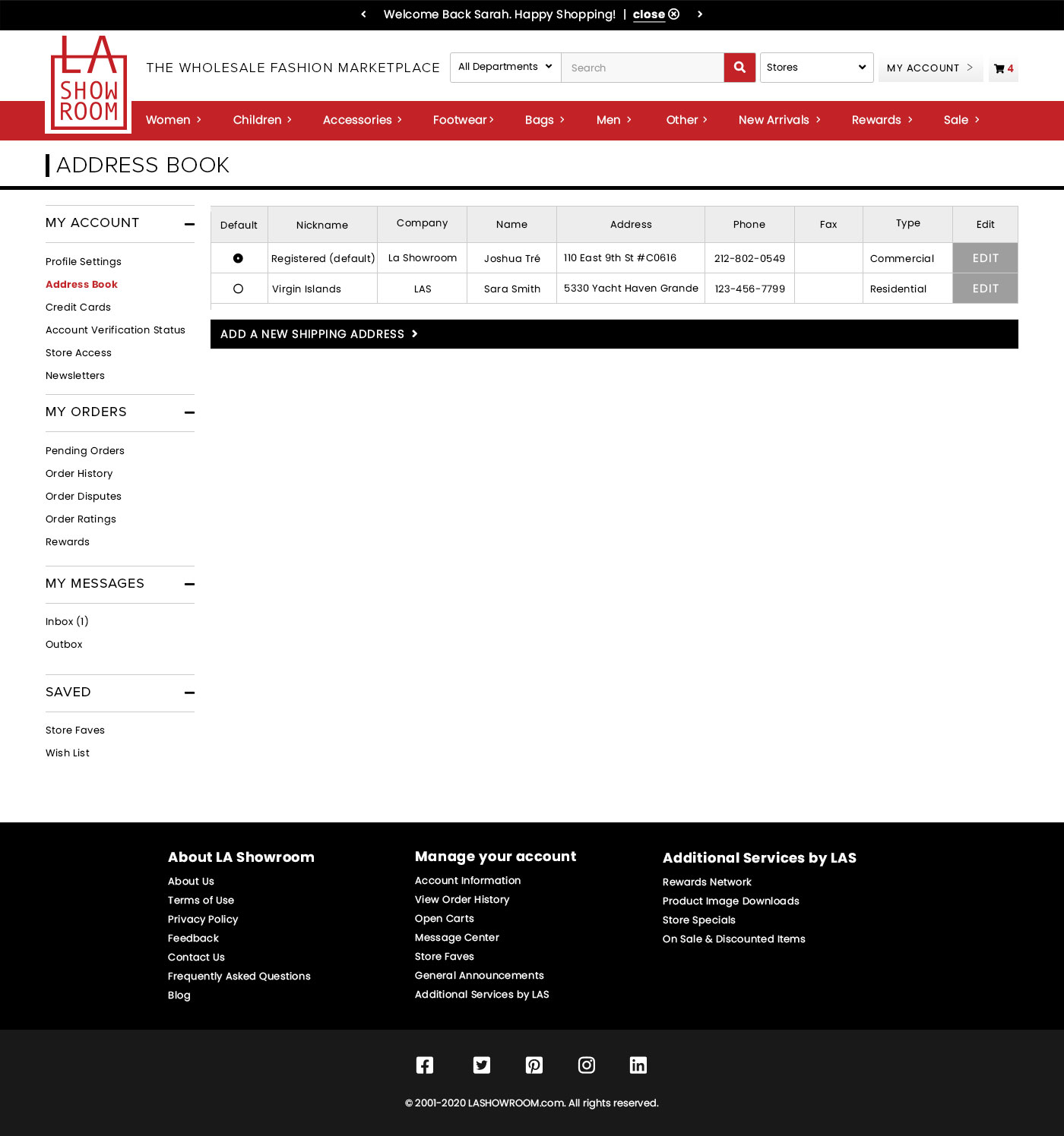
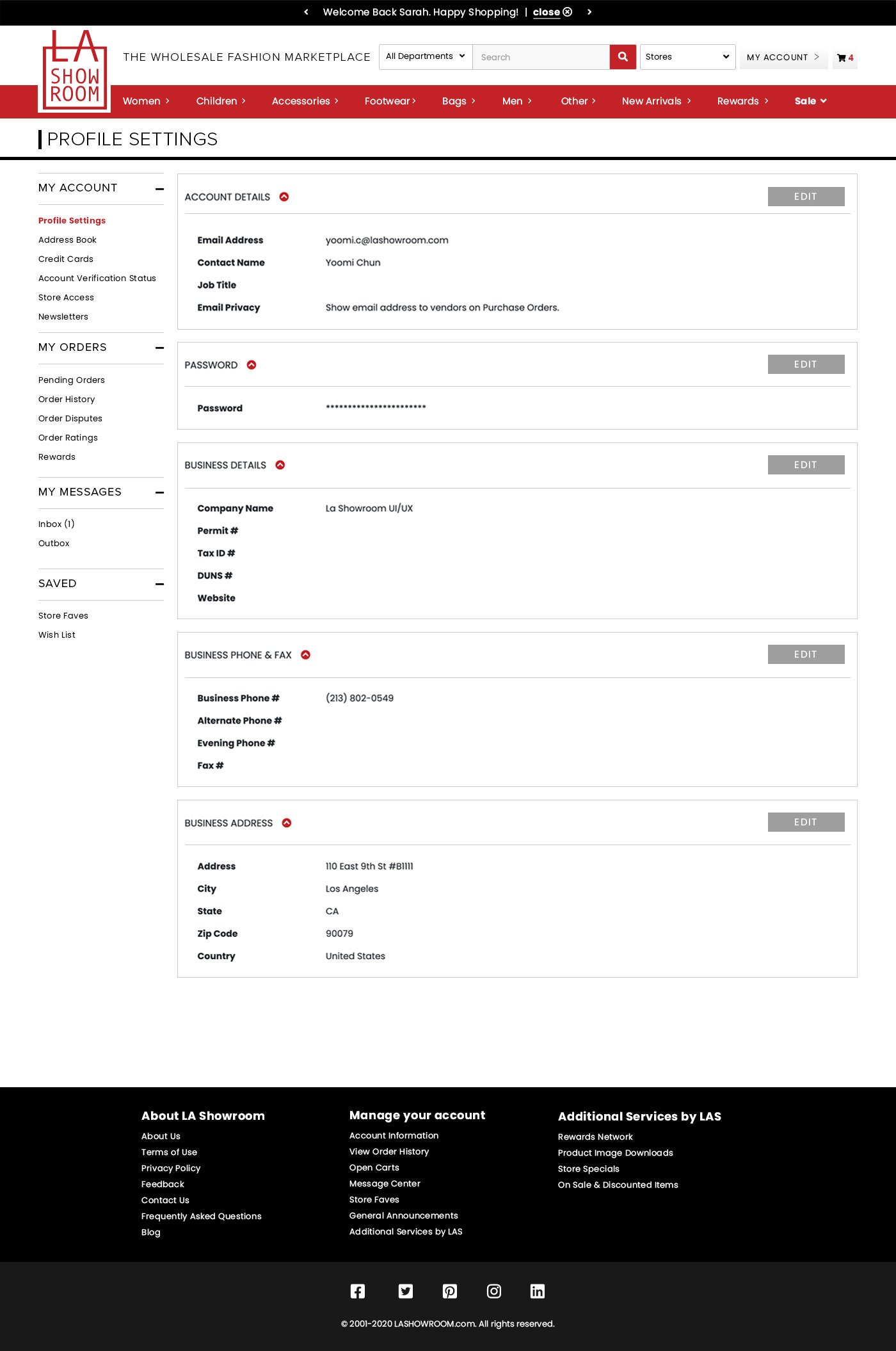
  • Colors: Over 17 arbitrary different colors used throughout the site with minimal method.
  • Fonts: No font treatments. Basic tags and fonts and used. No distinction on sizes and placements.
  • Contents: Contents were roughly put together by several members of staff without edit. There were typos, grammatical errors and repetitive content spread throughout the site.
  • Iconography: Icons were outdated and without proper description so as it made sense to the internal staff, they were often not clear to new users.
Function
  • Checkout System: LAS had a large traffic all the way up to the payment page – but buyers were making their final purchase on our competitor’s site.
  • Log In: Buyers were frustrated that every login/entrance would lead to the buyer announcement page instead of the product intended.
  • Advertisement: We were losing advertisers.
  • My Accounts: Very hard to navigate and find relevant information.
  • No Personalization: The site lacked a connected experience for our buyers.

Solution

Interface

  • Colors: Streamline the colors to 3 branding colors + 2 additional accents.
  • Fonts: Research our user base, find and update fonts that best matched personalities of our target audience.
  • Contents: Rewrite, edit, delete contents to make information brief and to the point.
  • Iconography: Update icons, graphics and infographics that are more relatable and easy to understand.

User Experience

  • Site Alignment: Current site is fixed at 1230px but depending on which page you land, the contents may be centered or full-width – I wanted to create a better landing experience so I fixed the content width at 1400.
  • Checkout System: LA Showroom had a larger footprint than one of our biggest competitors; however, our traffic would leave right before the checkout – often losing our buyers to our competitor in the last few stages. I’ve noticed that the traffic was dropping during the shipment stage – we have a multi-cart system but for each cart, users had to input individual addresses, shipment methods and credit card system. My immediate solution was to create a centralized payment system and a streamlined address input.
  • Log In: Originally, LA Showroom only had one method of logging in – no matter where you are on the page, you will land to your My Accounts landing page. I wanted shoppers to not lose their place in shopping (I.e. – if they were looking at a specific shirt, after login, pick up on that shirt) so I’ve implemented dynamic log in system.
  • Advertisement: The homepage of LA Showroom is advertisement areas for our Vendors. Cut the amount of advertisers displayed and focus on the higher, more visible advertisements.
  • My Accounts: Clean up the My Accounts pages – replace old/outdated content and highlight contents that relate directly to buyer’s orders and shipment. Make it easier to update credit card and shipment information.
  • Personalization: Make the site more relatable to the buyer – create personalized welcome messages, display individual point systems openly, announce new shops and favorite shops, etc.

Branding

LA Showroom’s branding colors are red, black and white. Recently, the company was acquired by our sister, previously rival company and the tagline – The Original Wholesale Fashion Market has been rebranded as Global B2B Fashion Marketplace.

Color

Black

#417e94

LAS Red

#c62a41

White

#2f3530

Fonts

Header: Proxima Nova
Body: Poppins

Changes

Current Site V11

The last UI update was done back in 2015. There are 17 arbitrary colors and untreated fonts throughout the site. UI was generally updated by developers until I joined the team in late 2018.

New Design V12 Beta

Took on the entire redesign immediately after being hired. Updating brand emphasis, streamlining repetitive and confusing contents, organizing content based on traffic and higher views and user relevance.

All Pages